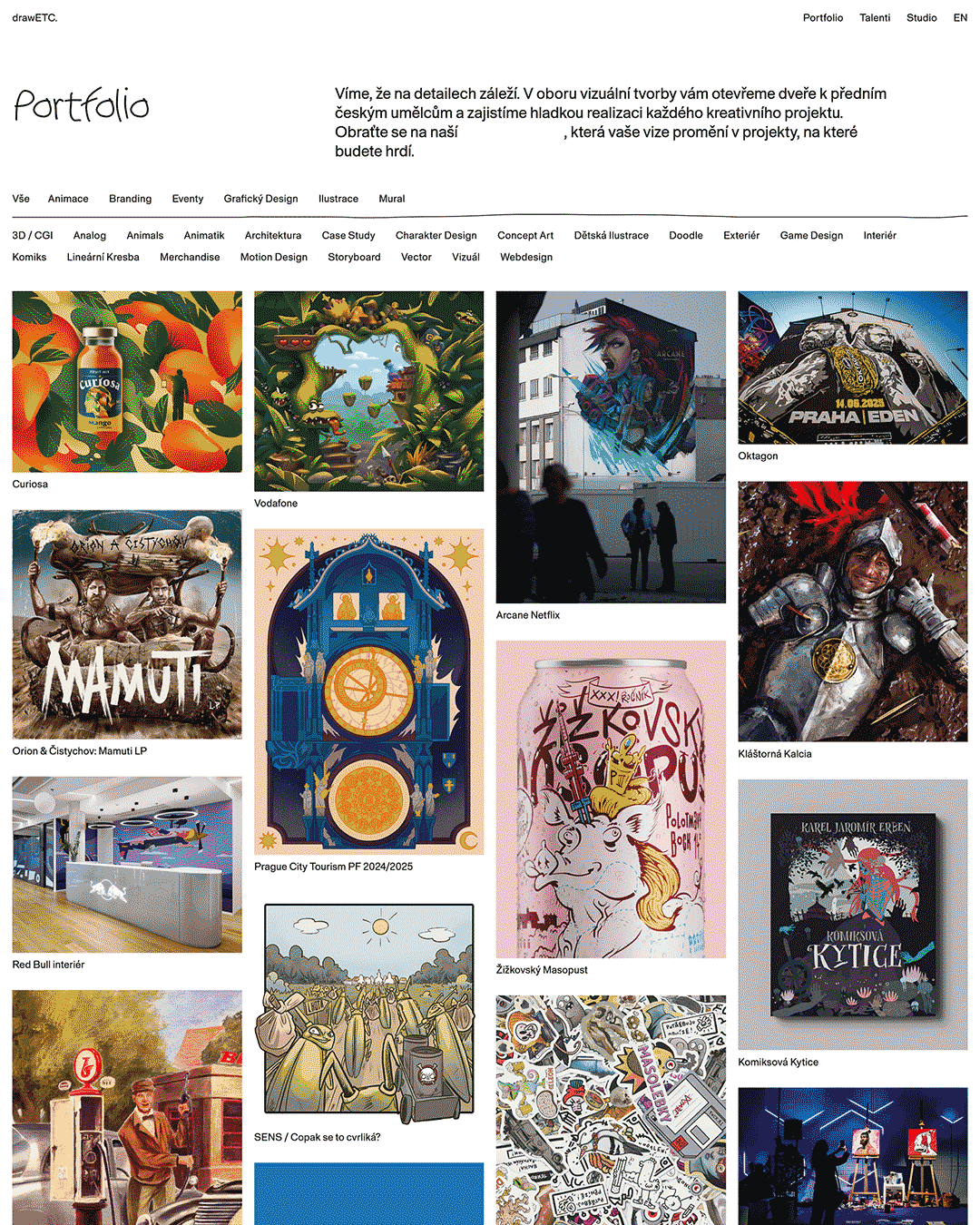
We'll take on any creative project. Sample our previous work to learn more about our process and vision.
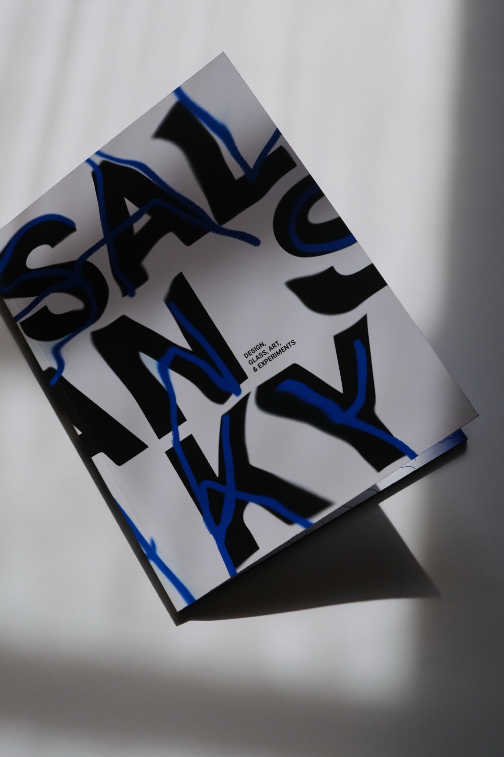
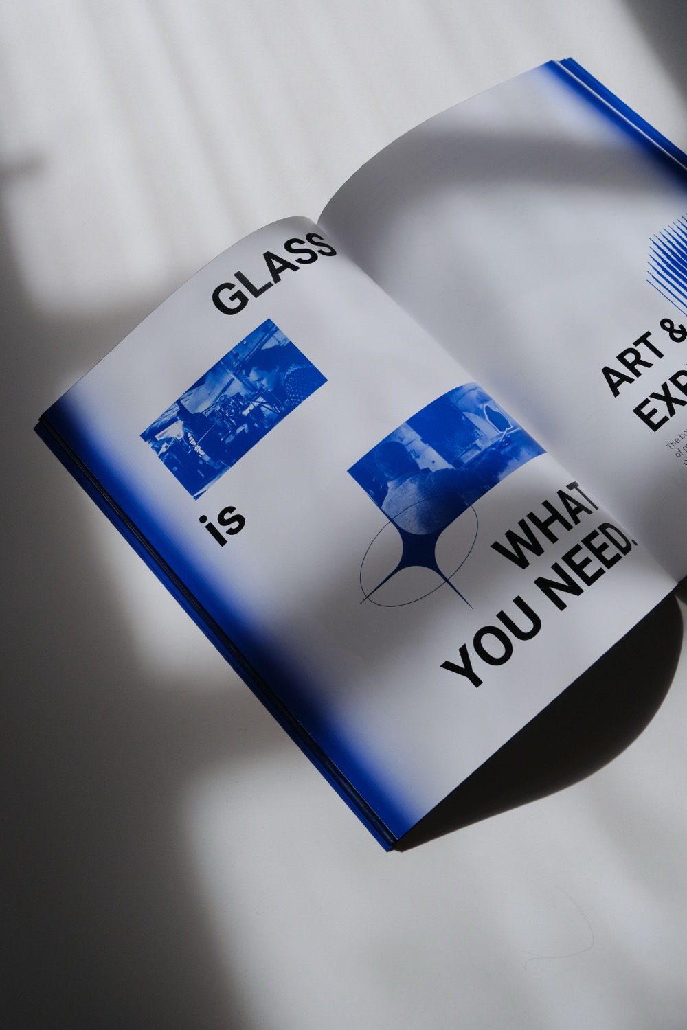
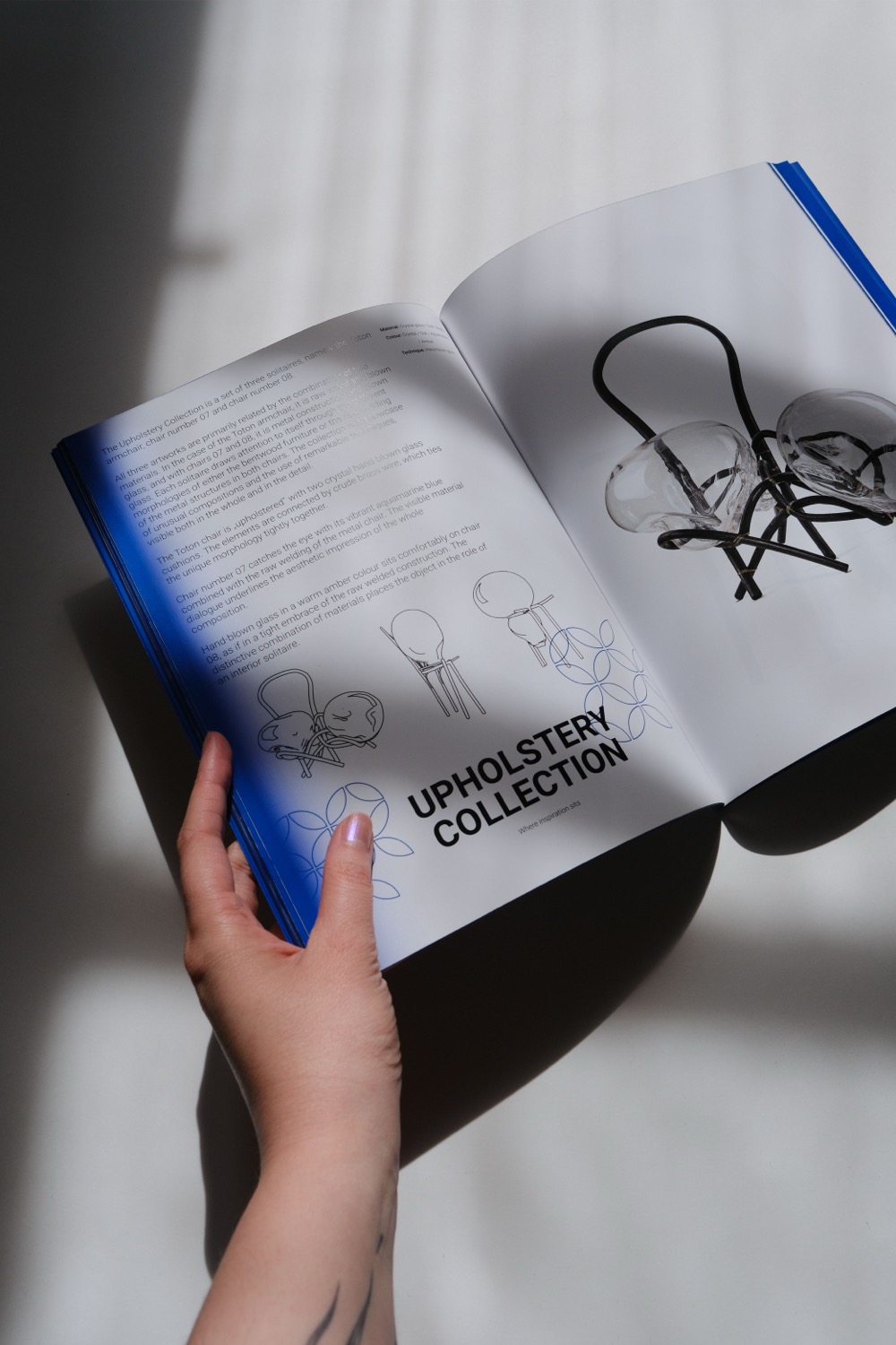
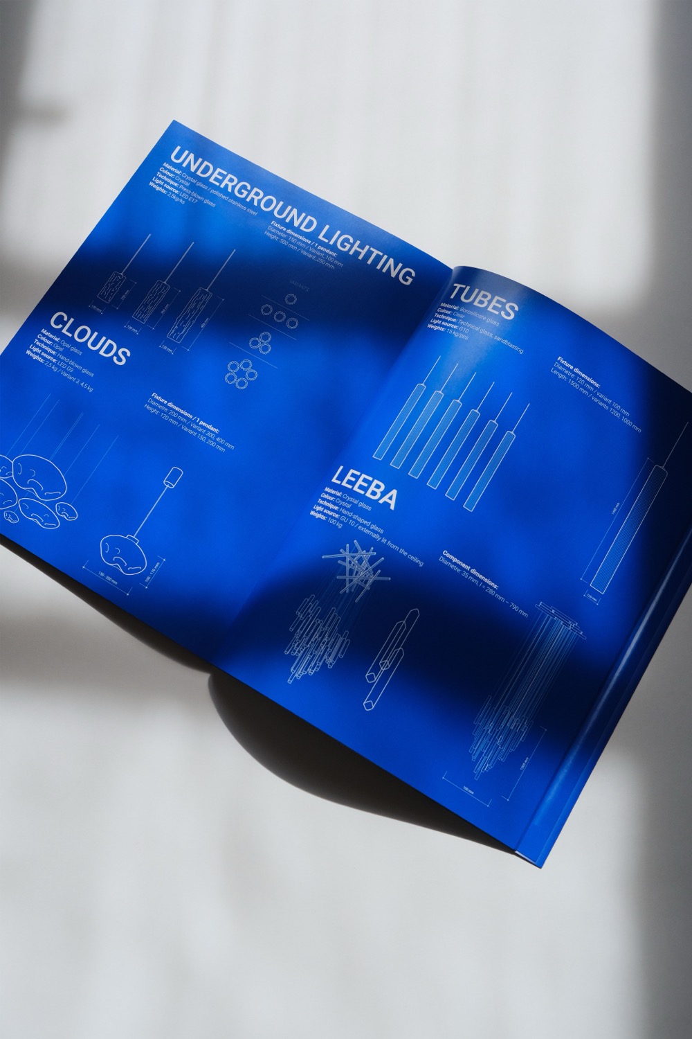
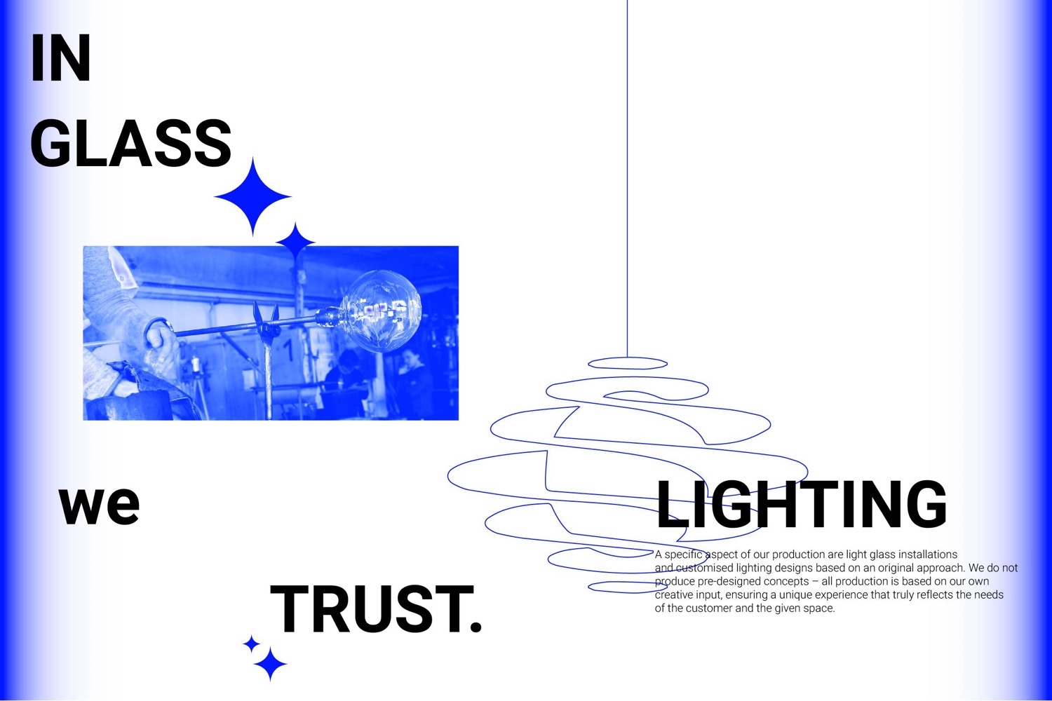
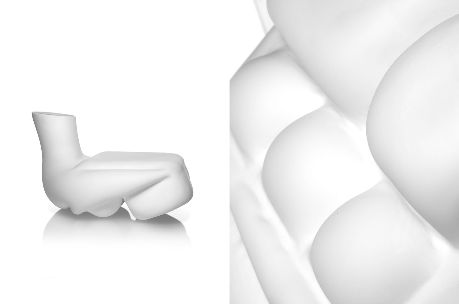
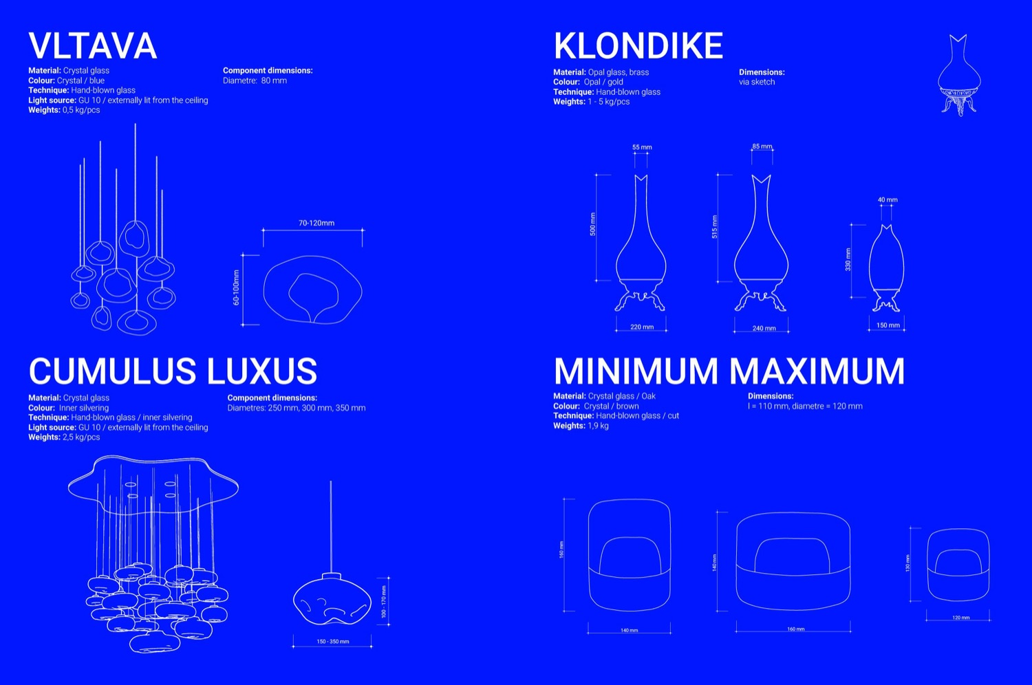
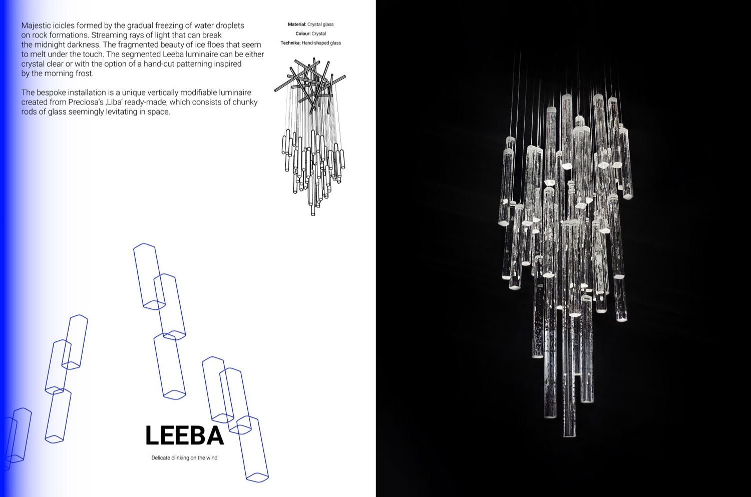
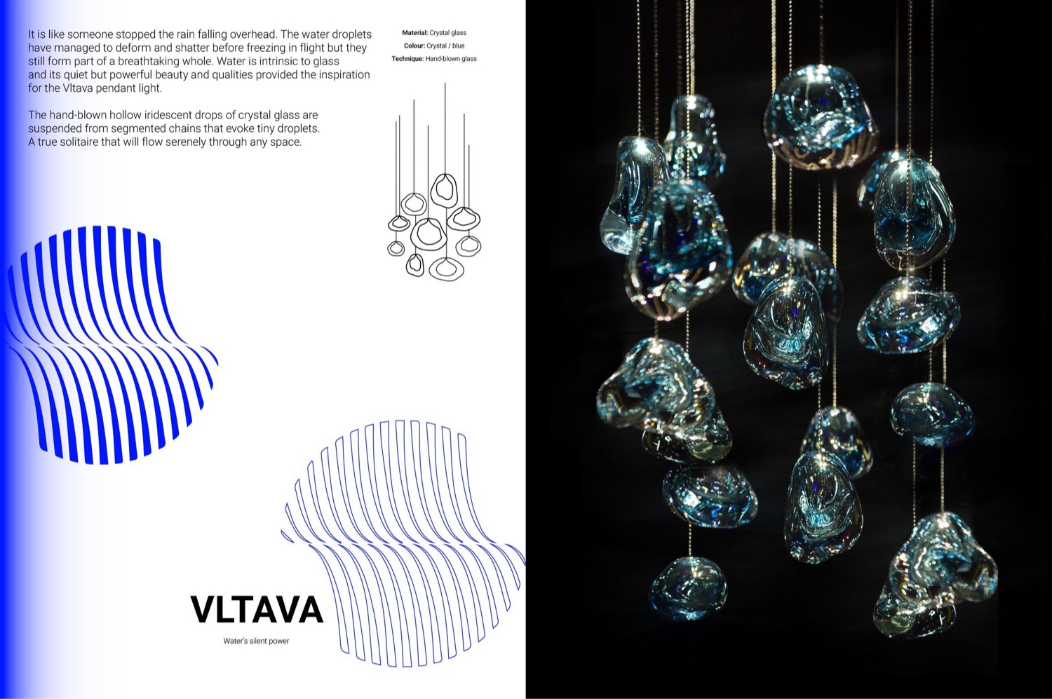
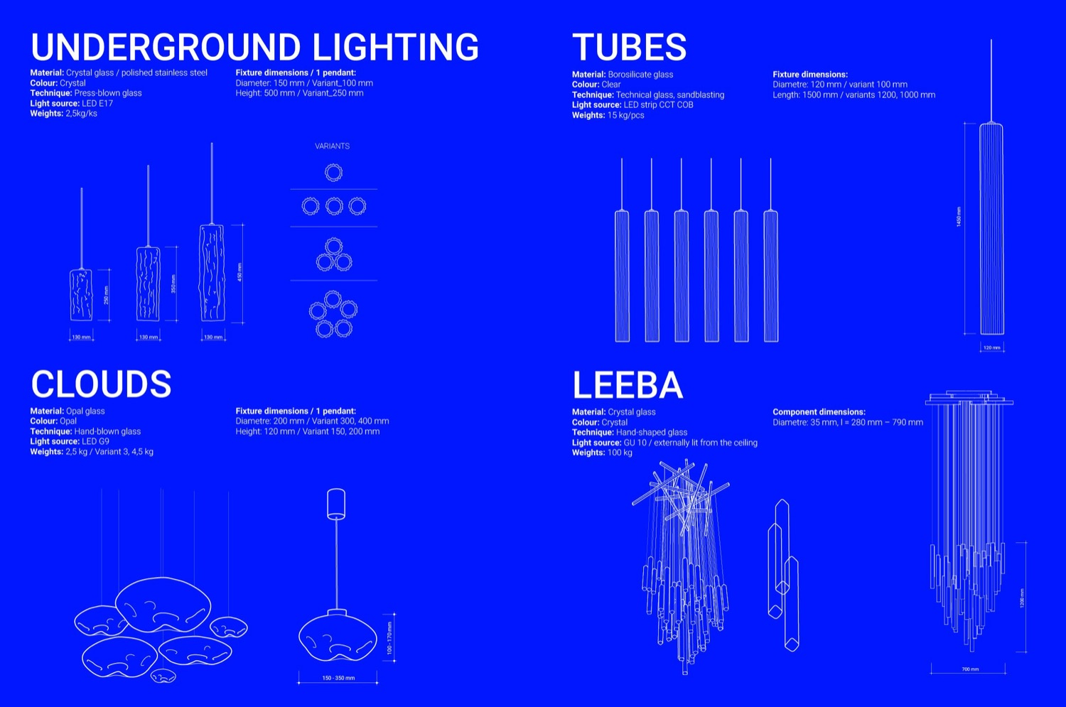
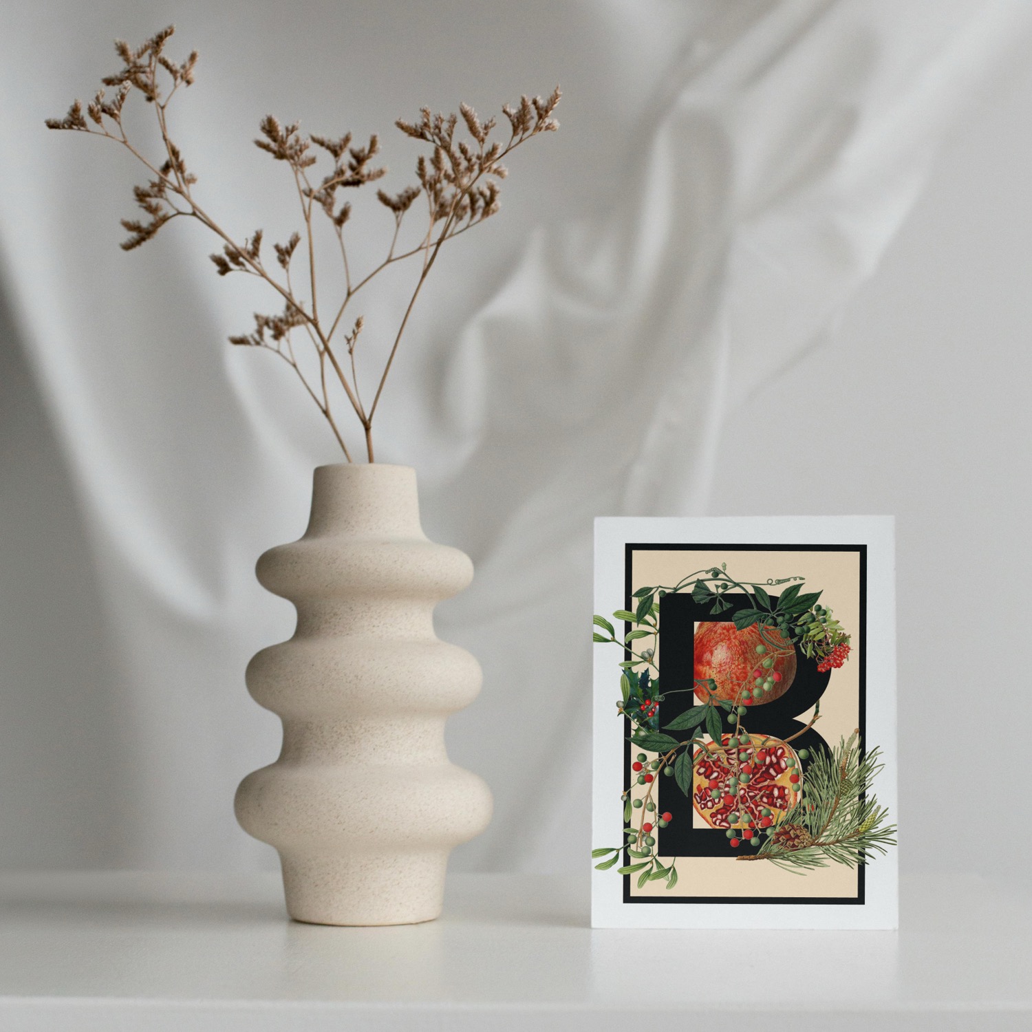
For design studio Salansky, which specializes in glass objects, lighting and interior statement pieces, we oversaw art direction and graphic design of their product catalogue. The brief also included a redesign of the brand's visual language, a new color palette and a set of graphic and illustrative elements that accompany the catalogue and give it a unified character.
The catalogue's visual identity is built on the contrast of bold typography, delicate illustrations and a distinctive blue gradient that runs through the entire material. This approach reflects the nature of the brand itself, where the craft tradition of Czech glass meets the contemporary design thinking of brothers Jan and Ondřej Salanský. Beyond the graphic design, we also contributed to the copy and illustrations that guide the catalogue from the studio introduction through to the detailed product sheets.
Credits
Client: Salansky studio
Art direction & graphic design: Markéta Kosinová
Copy: Jan Salanský, Ondřej Salanský, Markéta Kosinová
Illustration: Markéta Kosinová
Photo: Shotby.Us, Milan Bejbl, OBA Creators, Markéta Kosinová
Translation & proofreading: Františka Blažková
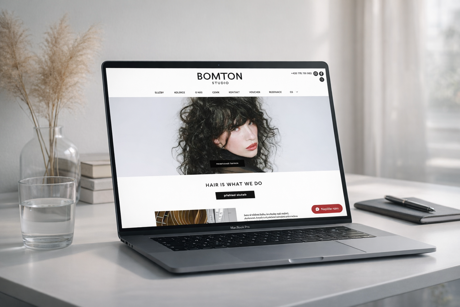
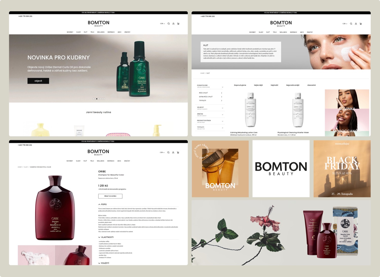
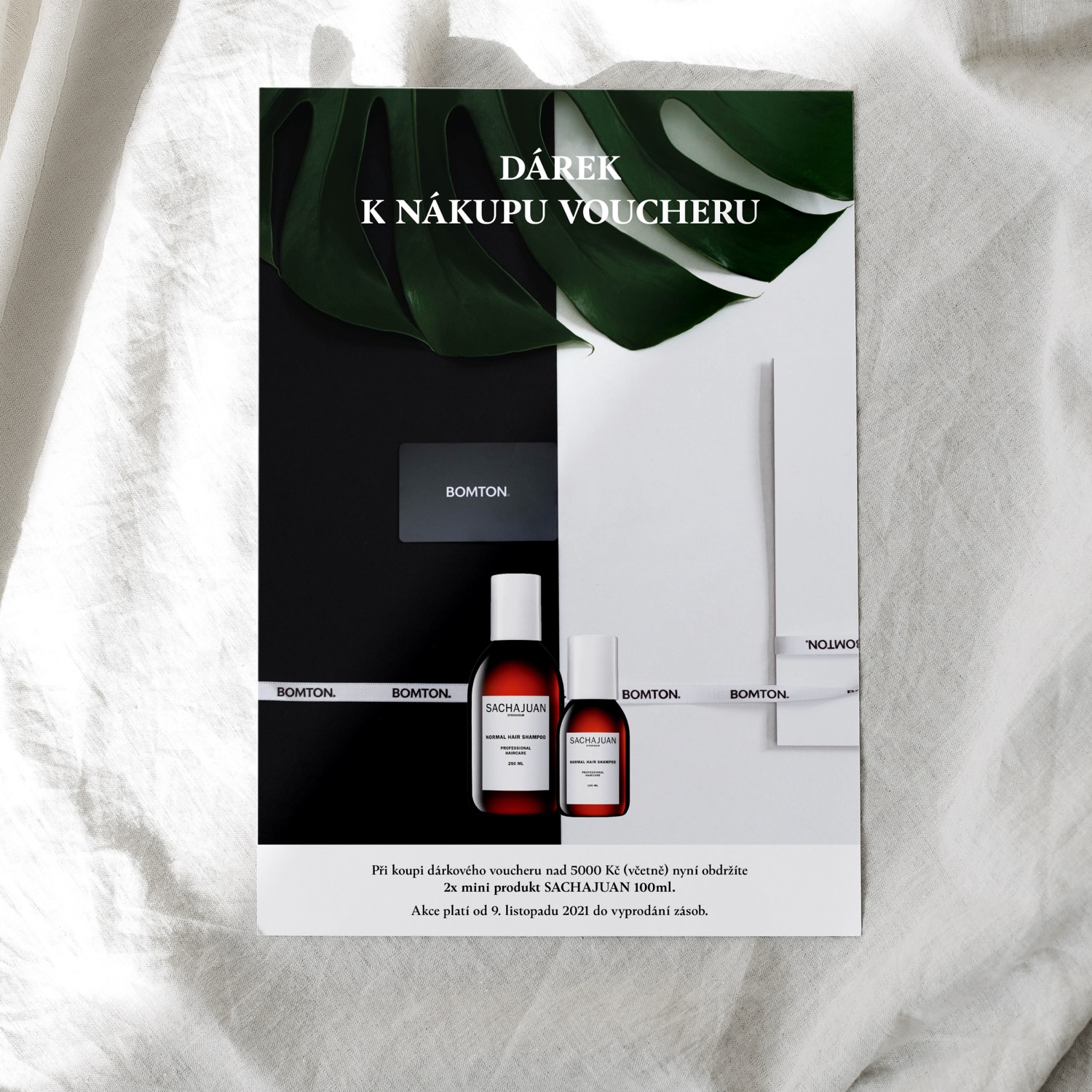
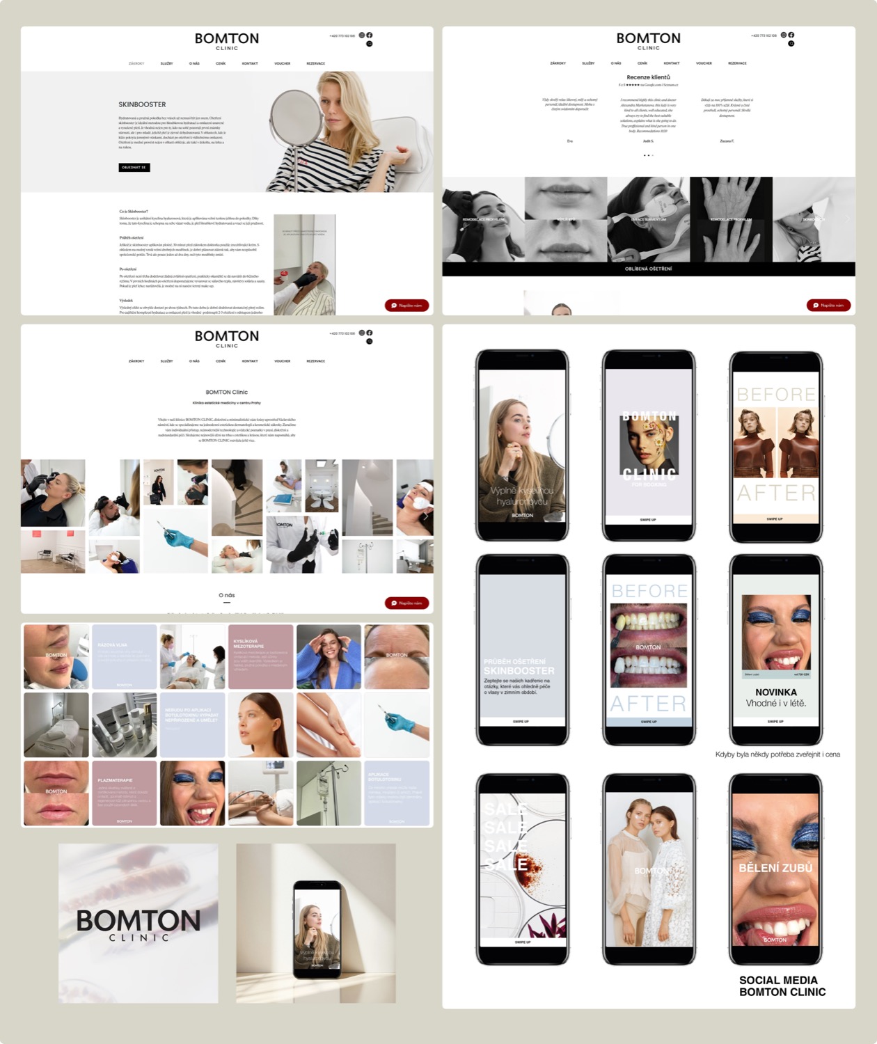
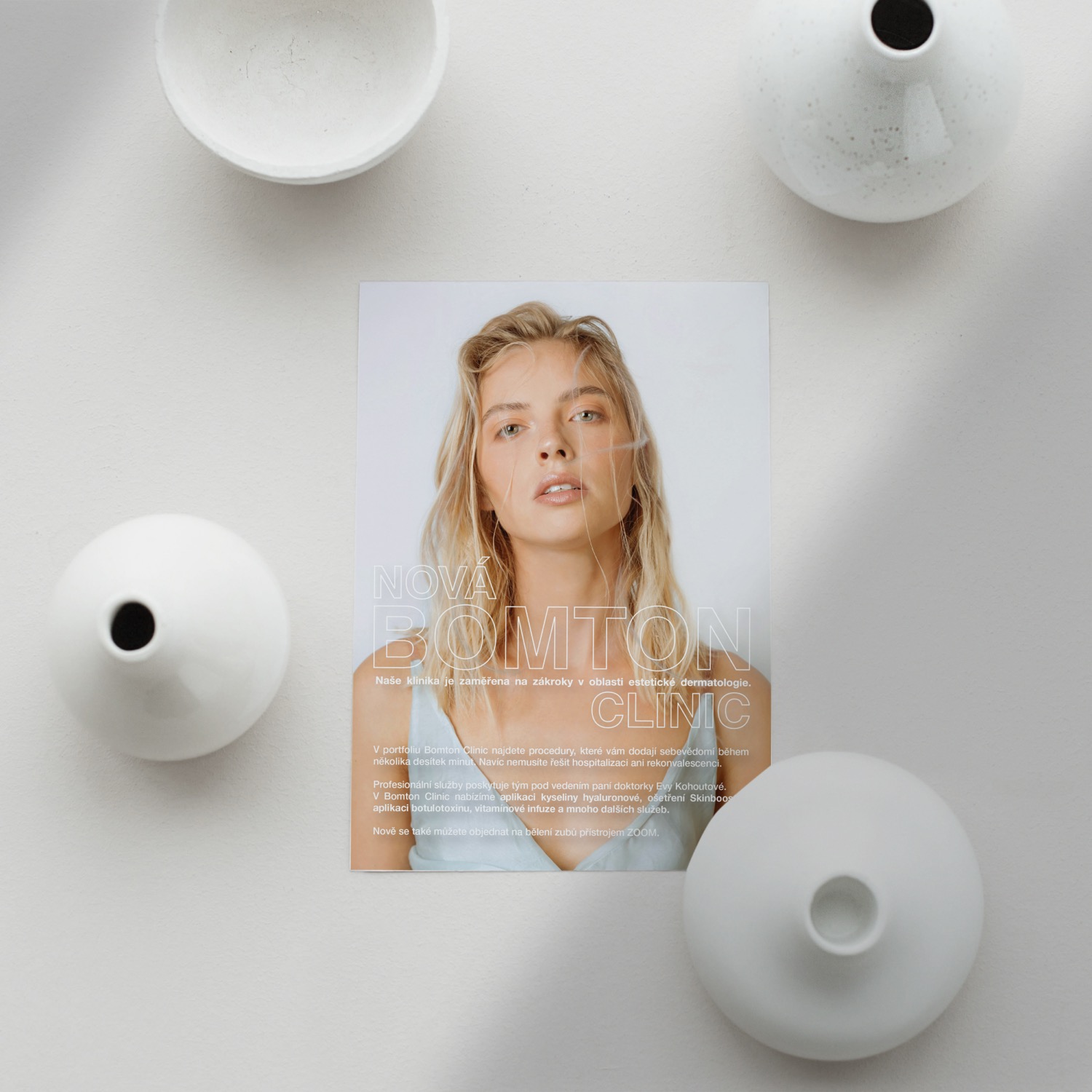
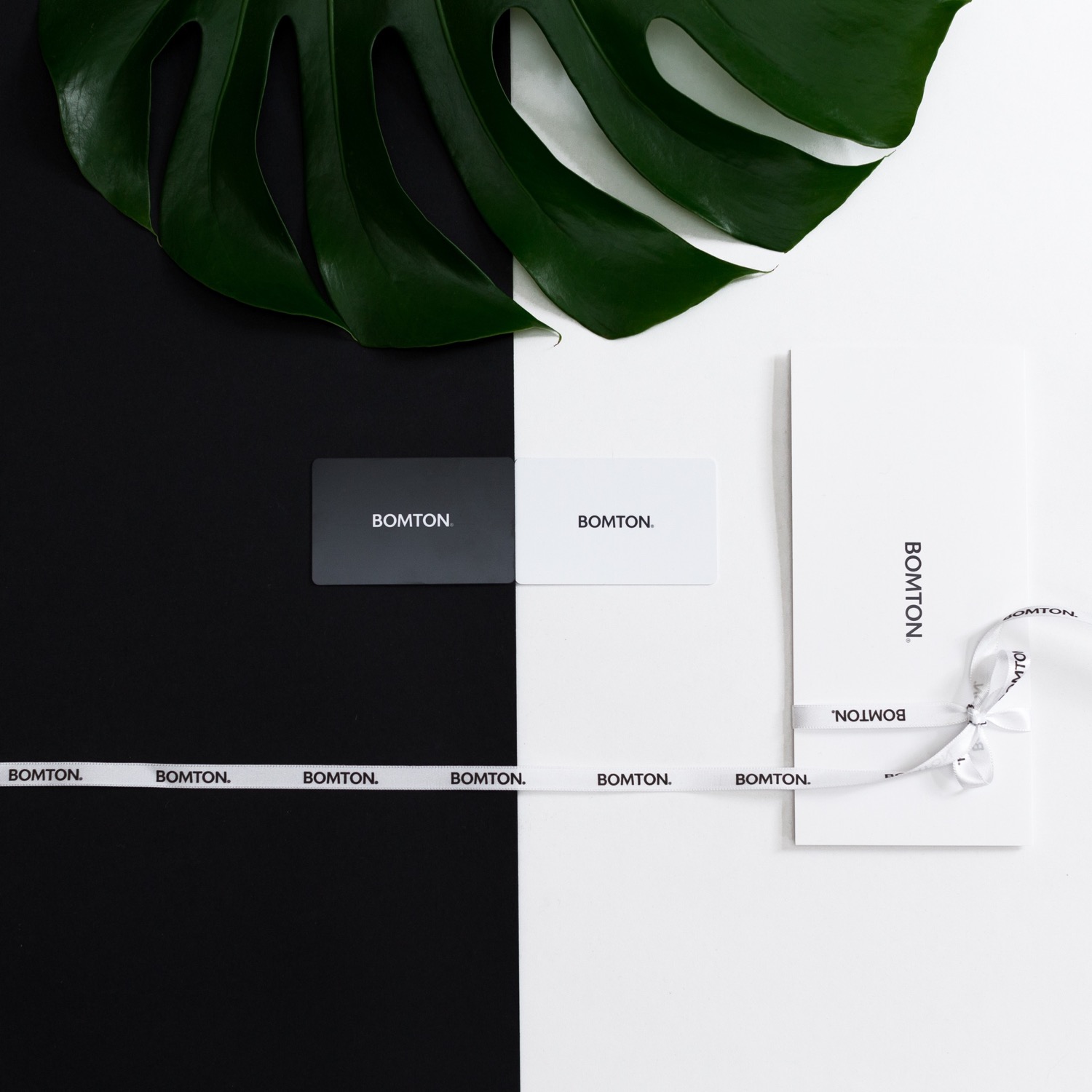
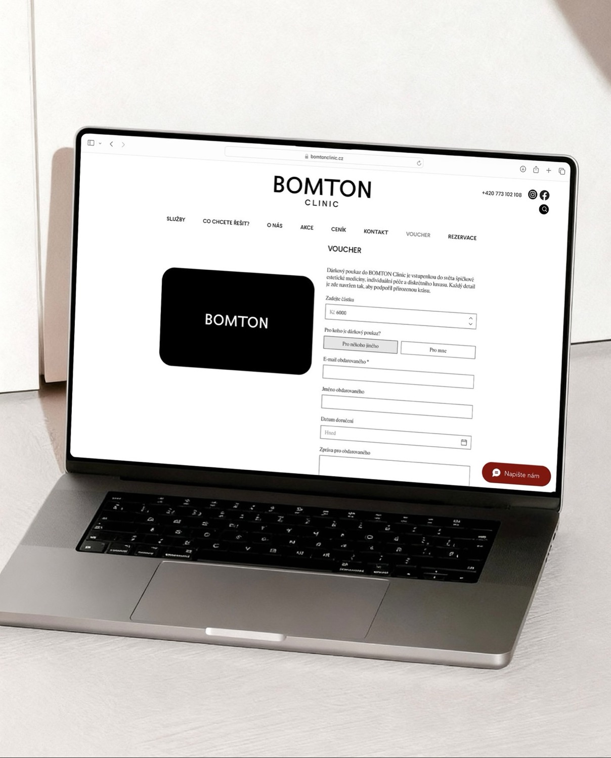
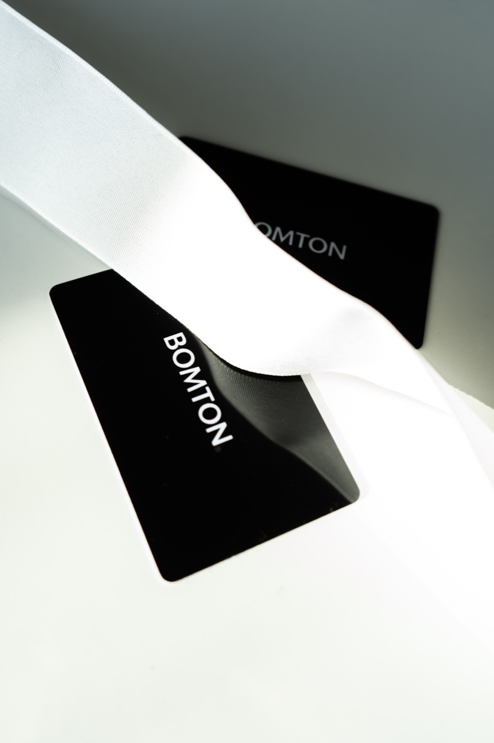
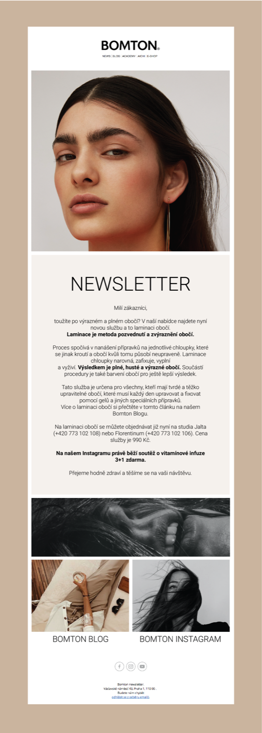
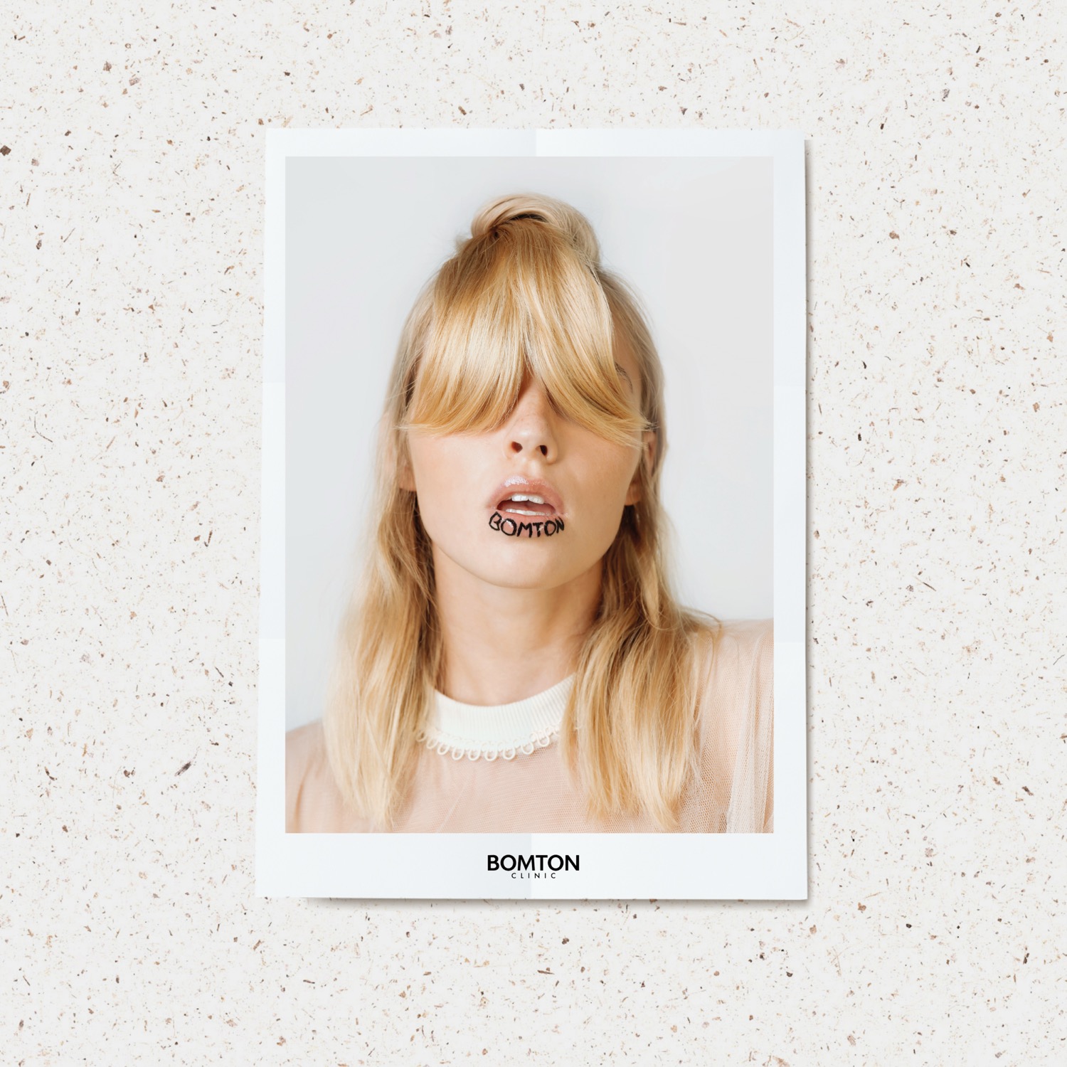
For the established brand Bomton, we oversaw a comprehensive redesign of the visual identity and website across three brands. Bomton Studio is a premium hair salon, Bomton Beauty an e-shop with hair care and cosmetics, and Bomton Clinic an aesthetic clinic that was launched alongside the completion of its brand identity.
Our role was art direction and the creation of a consistent visual language that clearly distinguishes each of the three brands while connecting them under one umbrella identity. The deliverables included a logo redesign, a typographic system and color palette, templates for social media posts and print materials including vouchers, newsletters and promotional collateral. The web design defined the structure and visual logic of the sites; the actual development and coding was handled by the Bomton team.
Credits
Client: Bomton Studio / Bomton Beauty / Bomton Clinic
Art direction & brand identity: Markéta Kosinová
Web development: Bomton
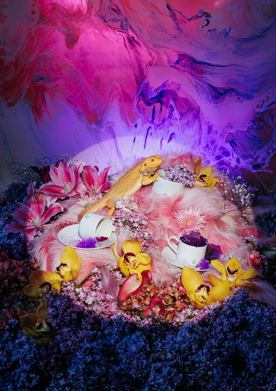
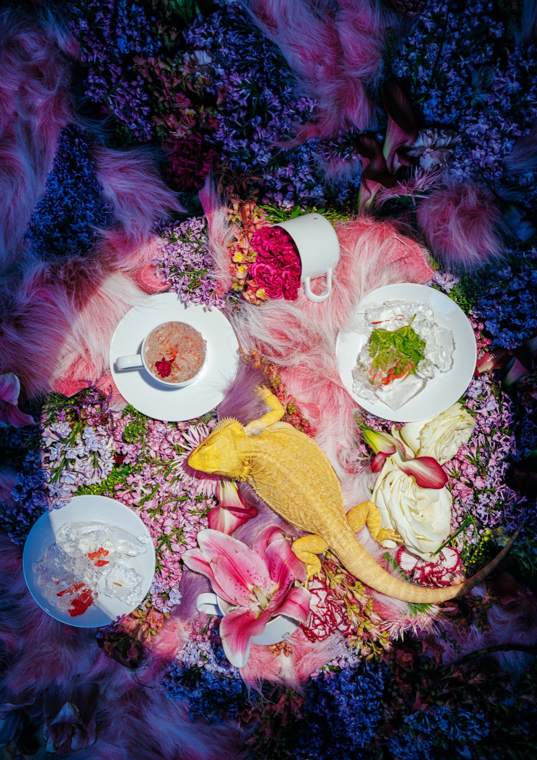
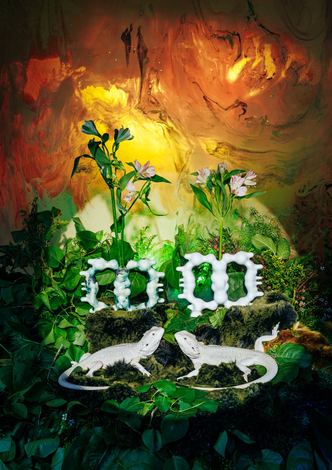
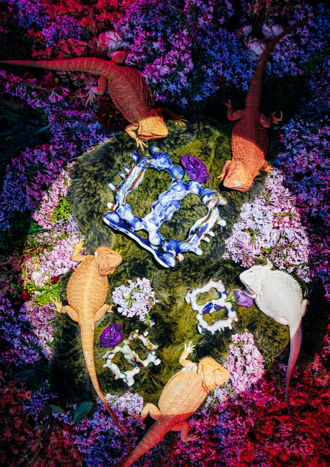
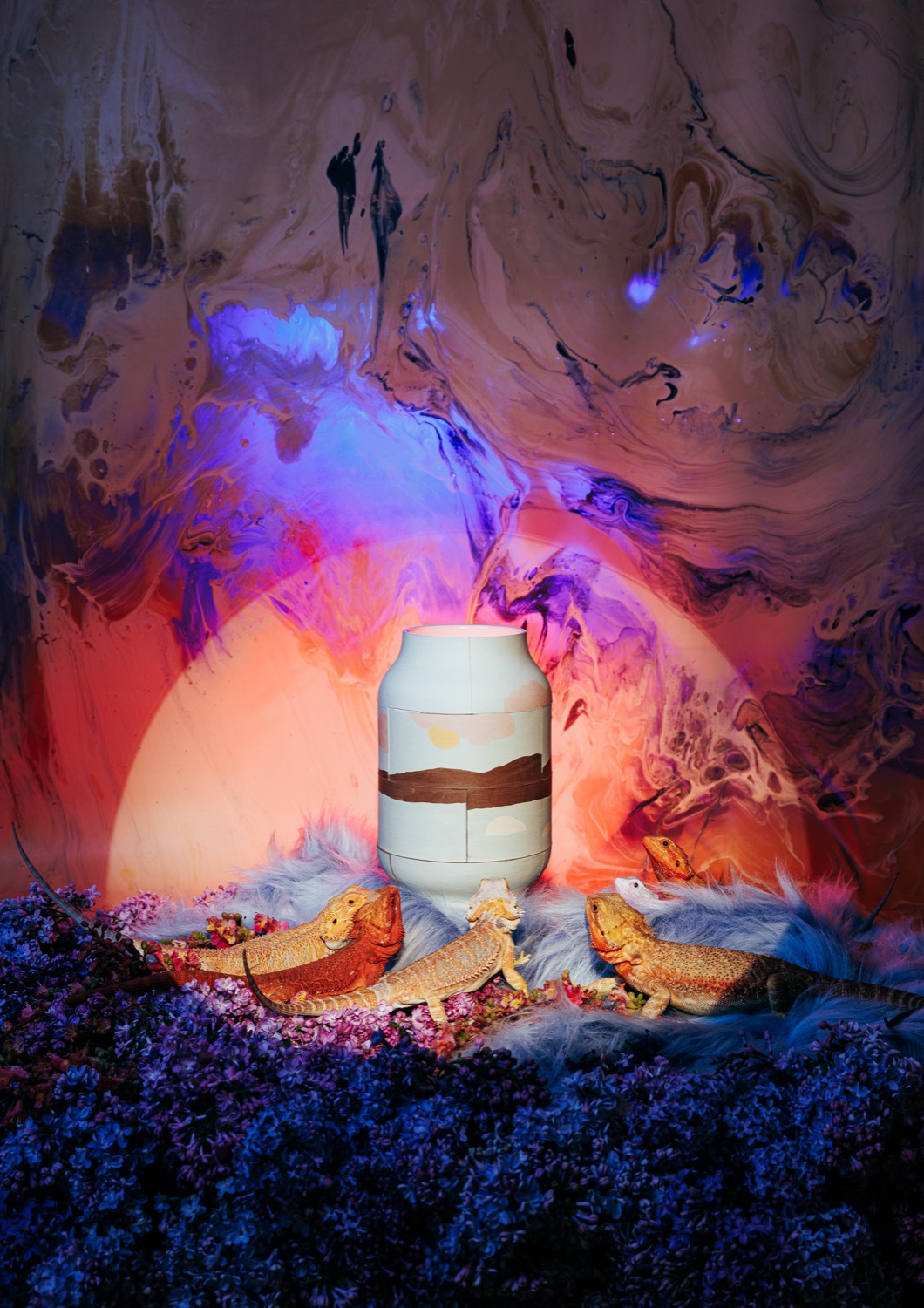
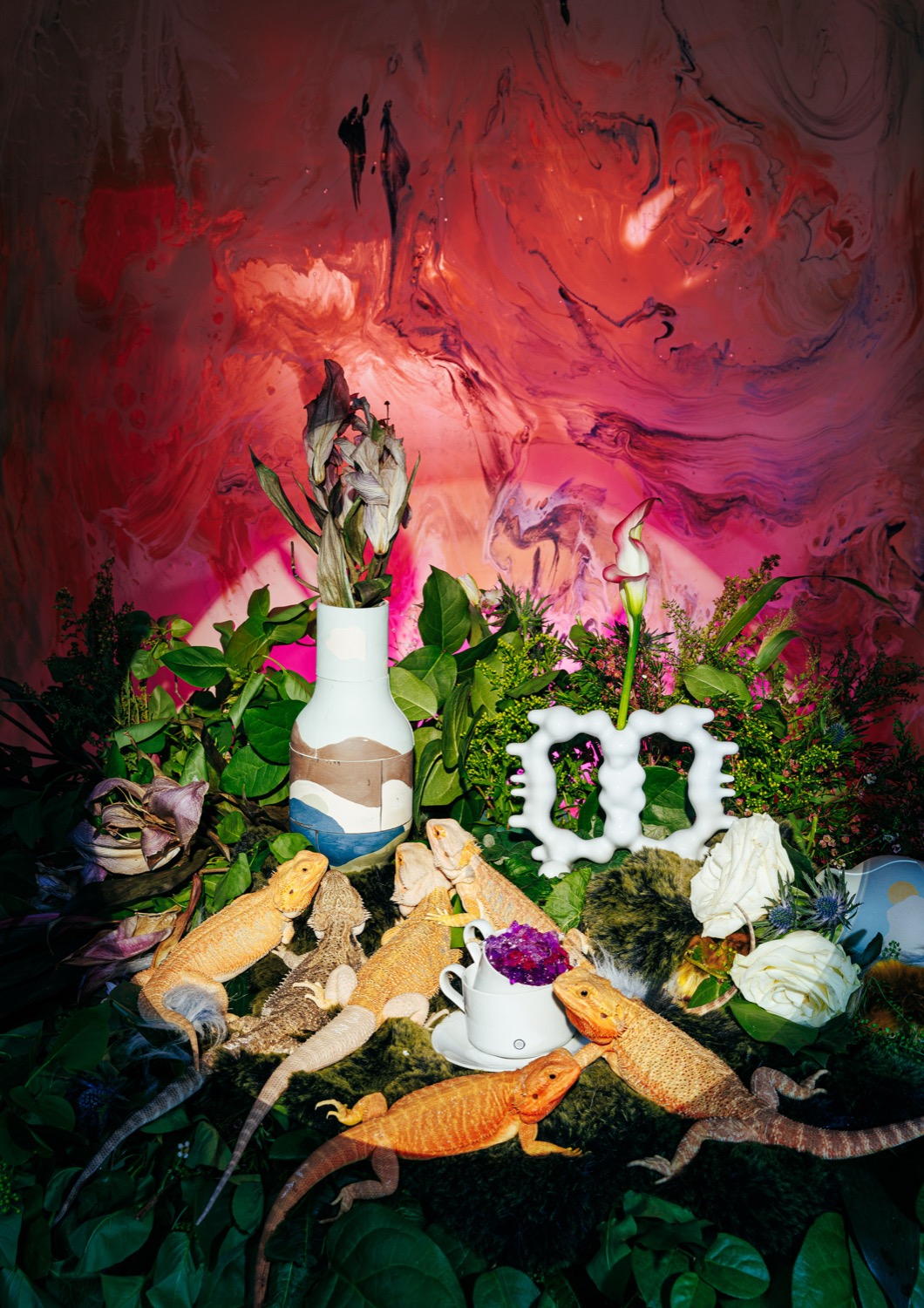
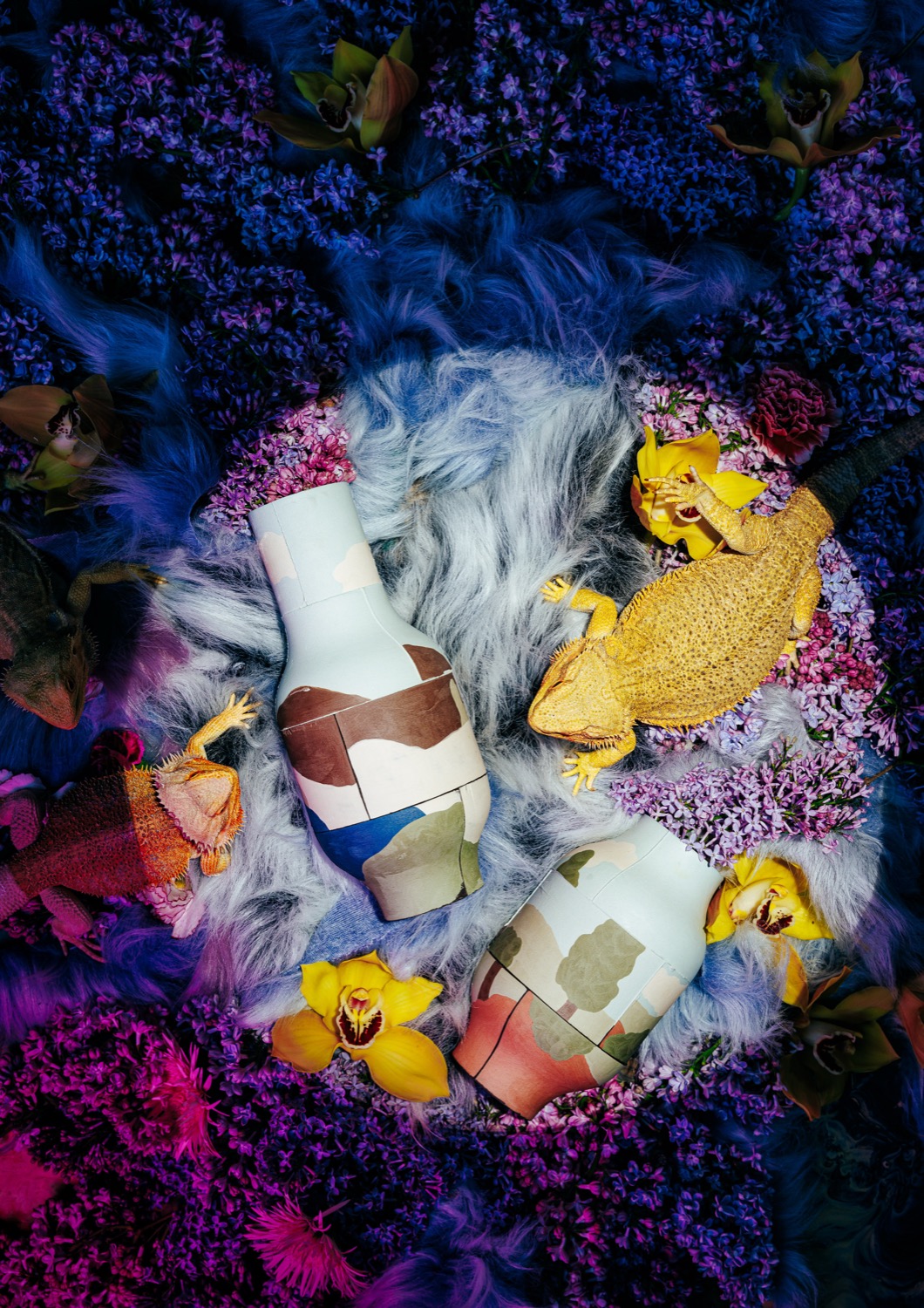
This photo series was created as a creative collaboration between Czech brand Křehký and Swarm Mag. As creative directors, we built the concept around a utopian vision of a world where nature has taken over and all that remains of humans are their artifacts – ceramic objects by young designers, claimed by lizards as their favorite gathering spots.
The series' visual language works with an explosion of colors, organic shapes and a deliberate overlap between design, nature and humor. The styling combined recycled fabrics from other designers with fresh and dried flowers and a unique latex fabric by Angel&Devil. The photographs are not digitally manipulated – the agamas were loaned from a reptile rescue shelter keeper and every scene is exactly as you see it.
The series was presented as part of the Křehký Mikulov 2023 exhibition and became part of the main display at Mikulov Castle. The campaign subsequently attracted attention in a number of design magazines and competitions.
Credits
Client: Křehký
Creative direction: Markéta Kosinová
Set design: Kateřina Hynková
Photographer: Ondřej Szollos
Photo assistant & retouch: Tomáš Jakubec
Production: Swarm Mag – Markéta Kosinová
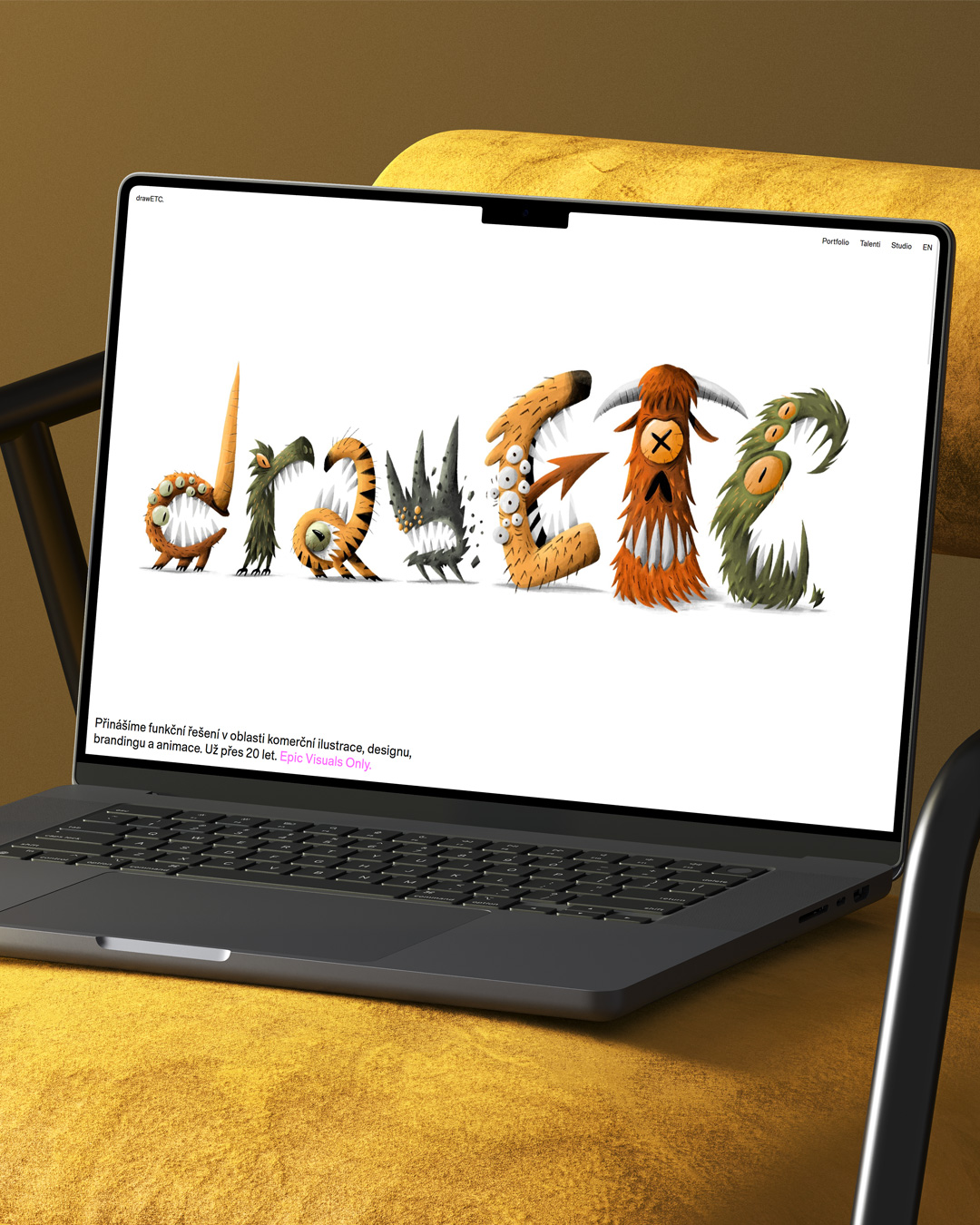
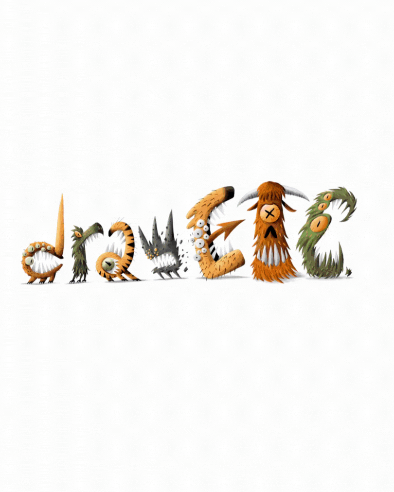
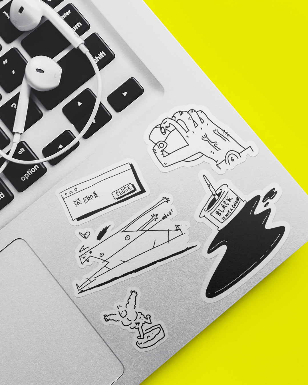
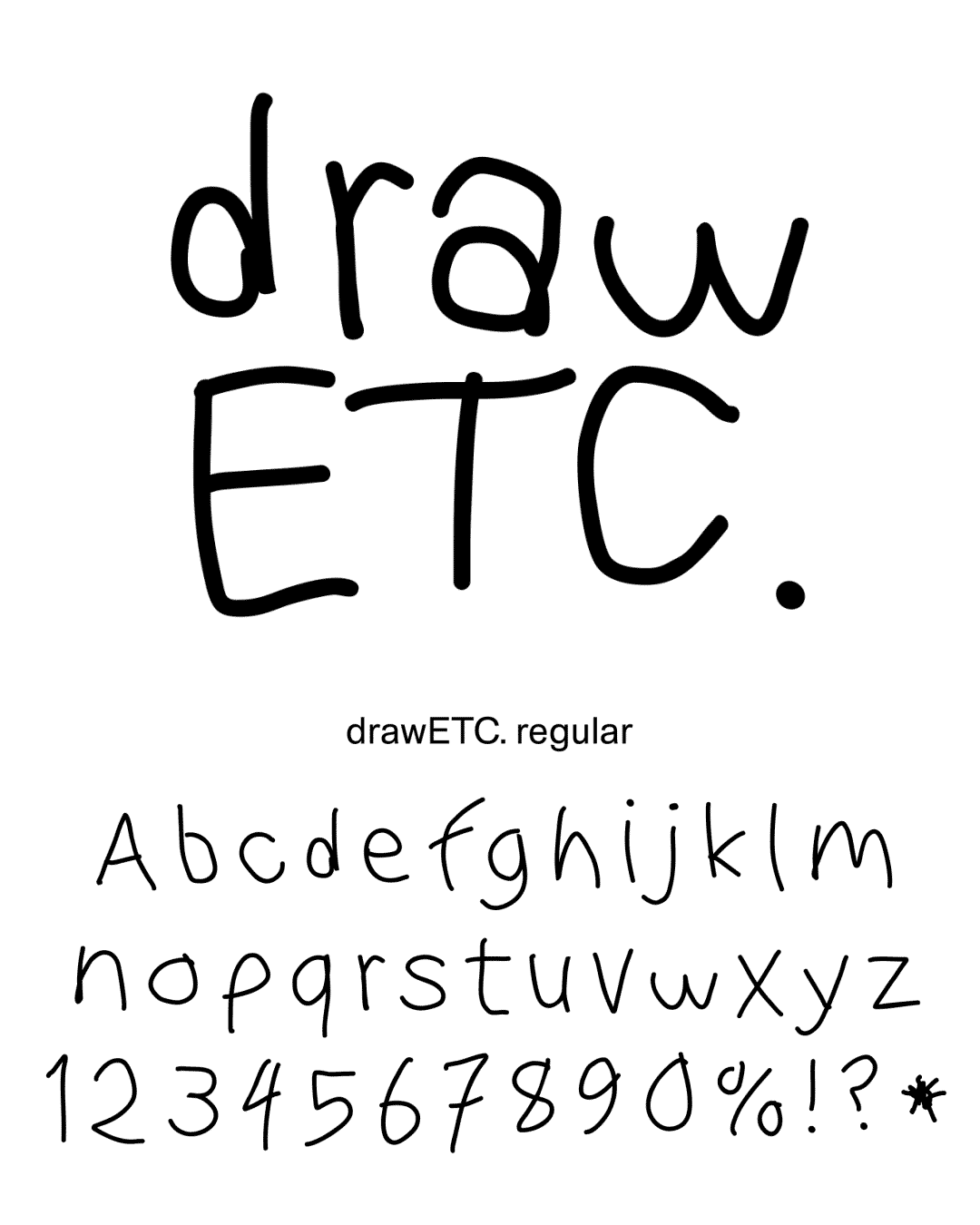
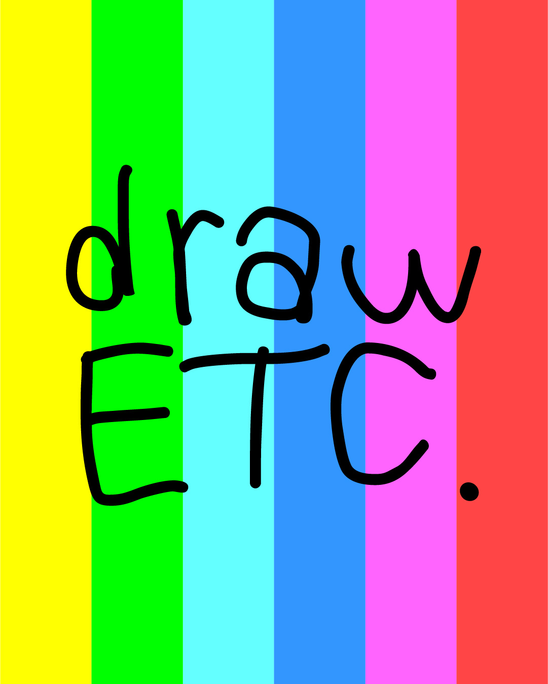
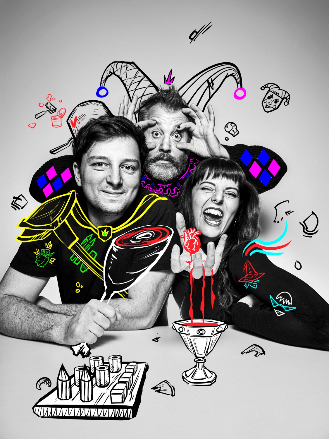
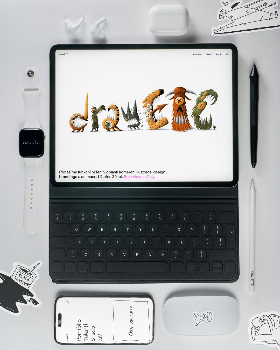
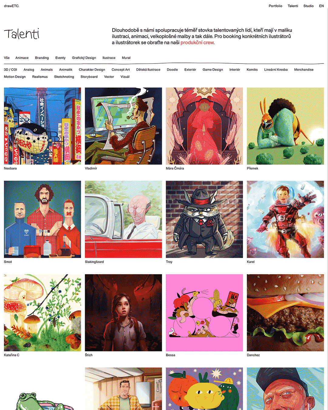
Together with art director Matúš Buranovský, we were behind the complete transformation of drawETC.'s visual identity. Over more than twenty years, the studio grew from an illustrators' collective into a creative unit that can handle a project from the first idea to the final result, and the new identity was meant to naturally reflect this journey. Illustration remains the studio's DNA, but today we weave it together with design, brand and production.
The new identity is built on the principles of anti-design, layering, playfulness and authenticity. We didn't want polished, we wanted real. Every illustrator in the roster was given space to create their own version of the logo, carrying their handwriting and personality. The resulting visual identity lives through this diversity while still holding together as a whole.
Matúš Buranovský designed the overall concept and web design, studio founder and illustrator Vladimír Strejček delivered the brand illustrations, and we led the project in the role of creative direction and production from the first idea through to its final launch.
Credits
Client: drawETC.
Art director & concept and web author: Matúš Buranovský
Creative direction & production: Markéta Kosinová
Illustration: Vladimír Strejček
Typography: drawETC. font (daFont + adjustments by Žofie Kosová), Contextype (Robert Finkei and Michal Chrastina)
Logos by illustrators: Přemek Ponáhlý / Daniel Korta aka Danchez / Barbora Kmecová aka Bessa / Tomáš Pánek / Tomáš Svoboda aka SMOT / Karel Cettl / Adam Mihalov / Troy / Marek Černý aka Macomix / Marek Kulhavý aka Mára Čmára / Kateřina Coufalová / Matúš Buranovský / Matěj Špatenka / Daniel Tejnický / Vladimír Strejček / Pavel Tran aka Panda / Markéta Kosinová / Alena Klesová / Nastja Davydova
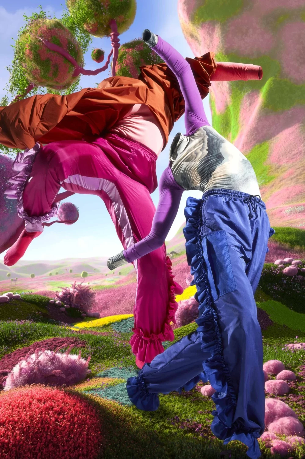
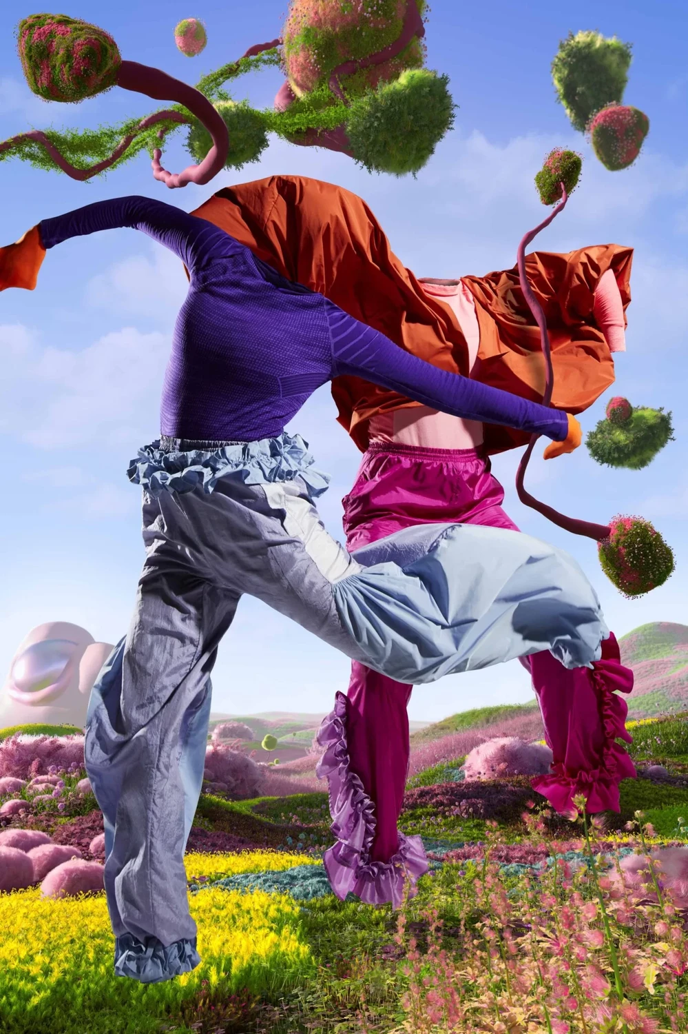
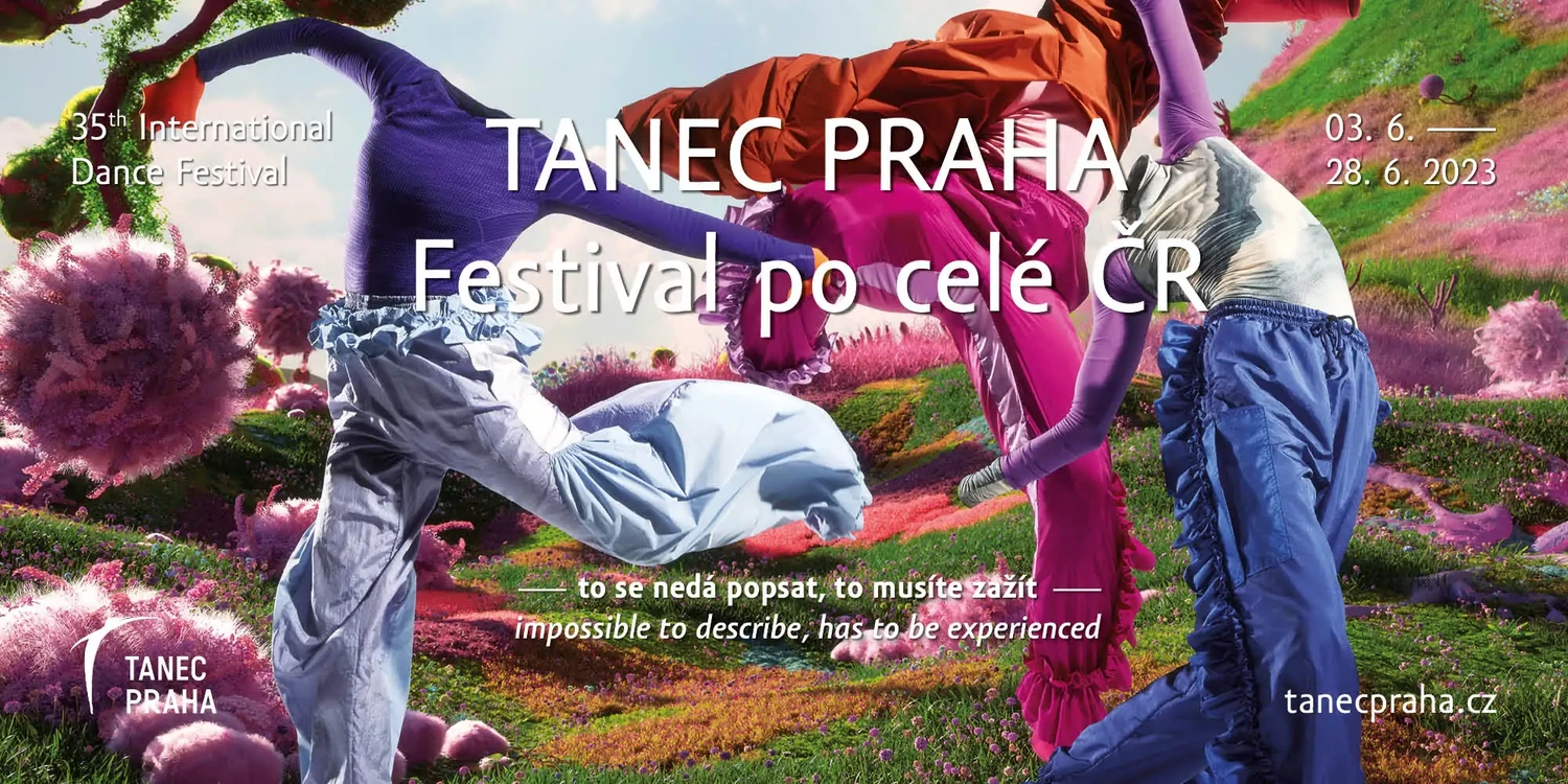
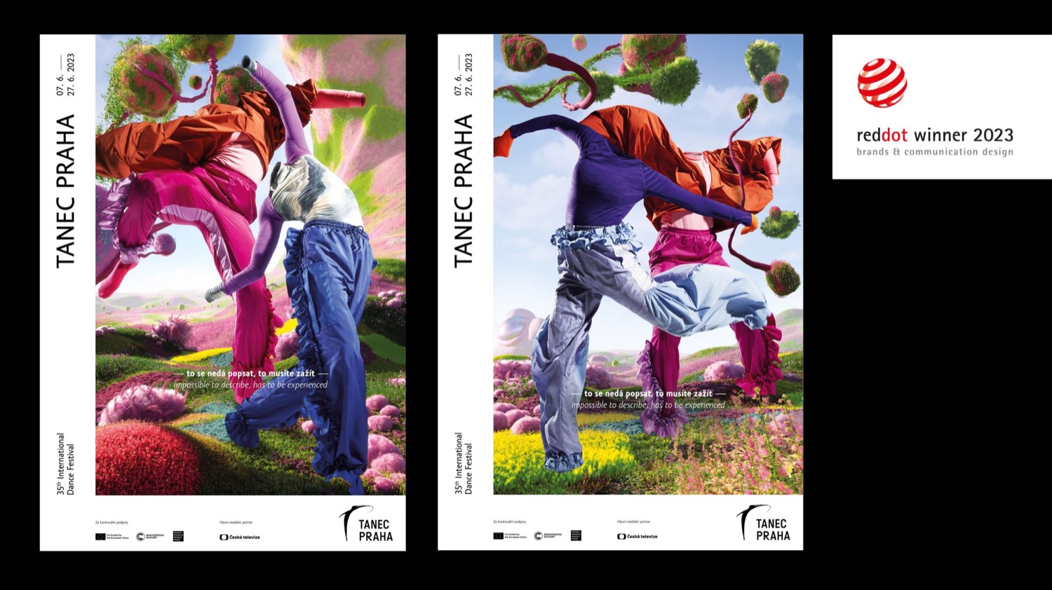
For the campaign for the 35th edition of the Tanec Praha festival, we handled production coordination. The campaign, built on the idea that the experience of dance cannot be conveyed but only lived, was created within the Alternaut collective under the creative lead of Roman Číhalík and the photographic work of duo Shotby.us.
The visuals and the spot, set in a fantastical virtual landscape, play with the contrast between authentic human movement and its untransferability. Spot director Jiří Horenský deliberately emphasized this "absence" of dancers in the video using VFX effects. As production coordinators, we ensured a smooth shoot and coordination across the entire team.
The campaign was awarded the Red Dot Design Award 2023 and gained international attention on the Ads of the World platform.
Credits
Client: Tanec Praha
Creative lead: Roman Číhalík
Photo / art direction: Shotby.us
Costumes: Kateřina Hynková
Production: Alternaut collective
Production coordinator: Markéta Kosinová
Director: Jiří Horenský
DoP: Filip Knoll
Editing: Vojtěch Cvrkal & Jiří Horenský
VFX: NotReal / Sebastian Baalbaki & Lucas Saidl
Music: Jakub Kaifosz
1st AC: Matyáš Hroh
Gaffer: Jaro Ďurčovič
Dancers: Eva Stará, Tereza Holubová, Radim Klásek
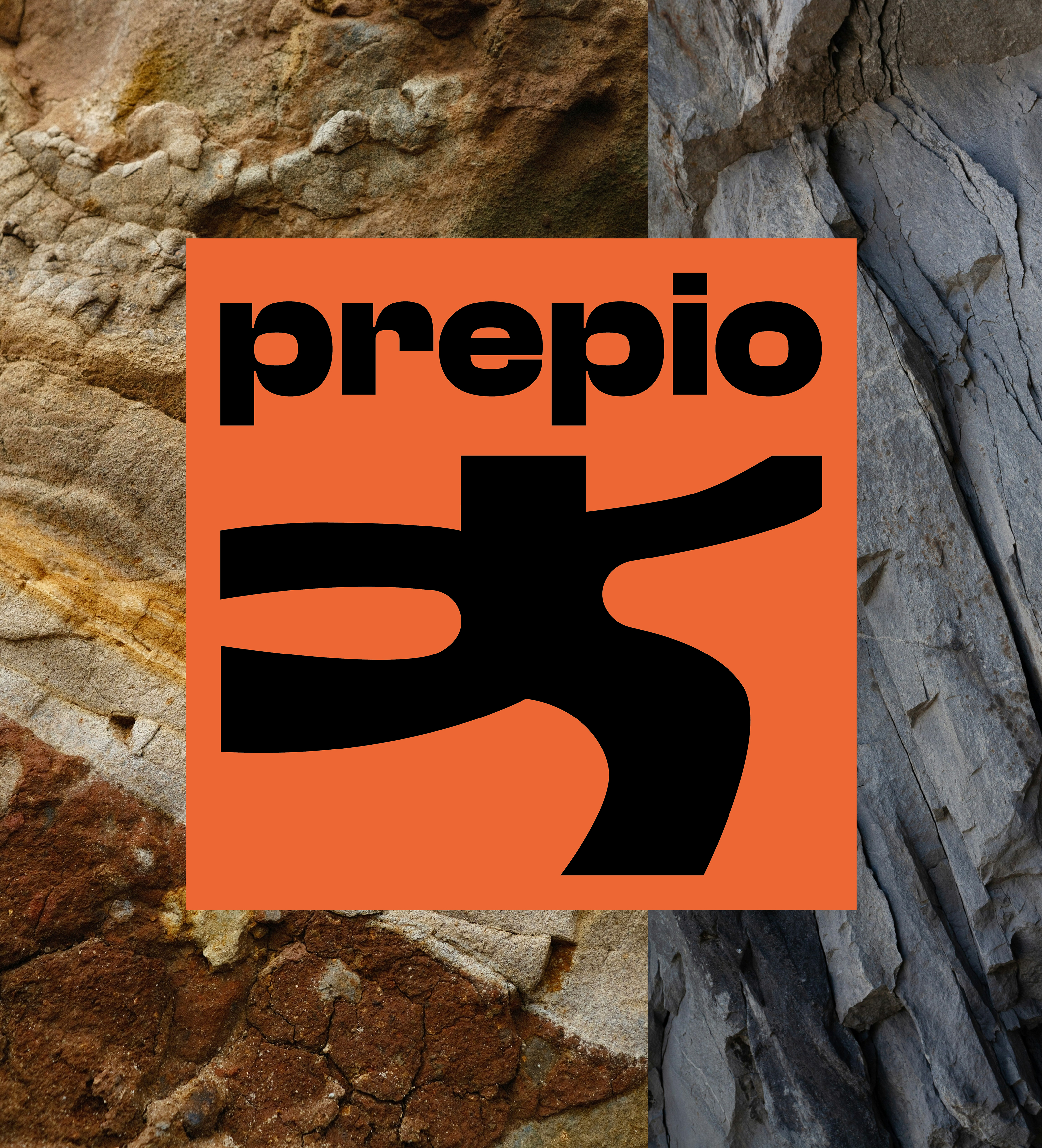
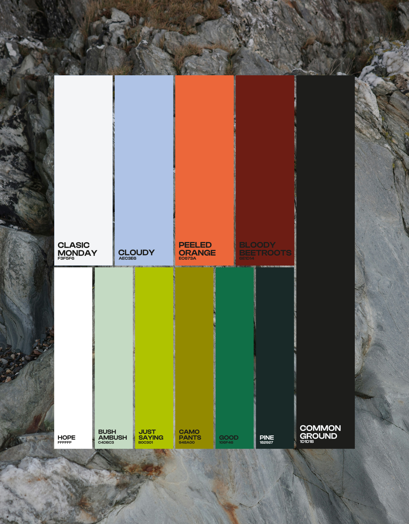
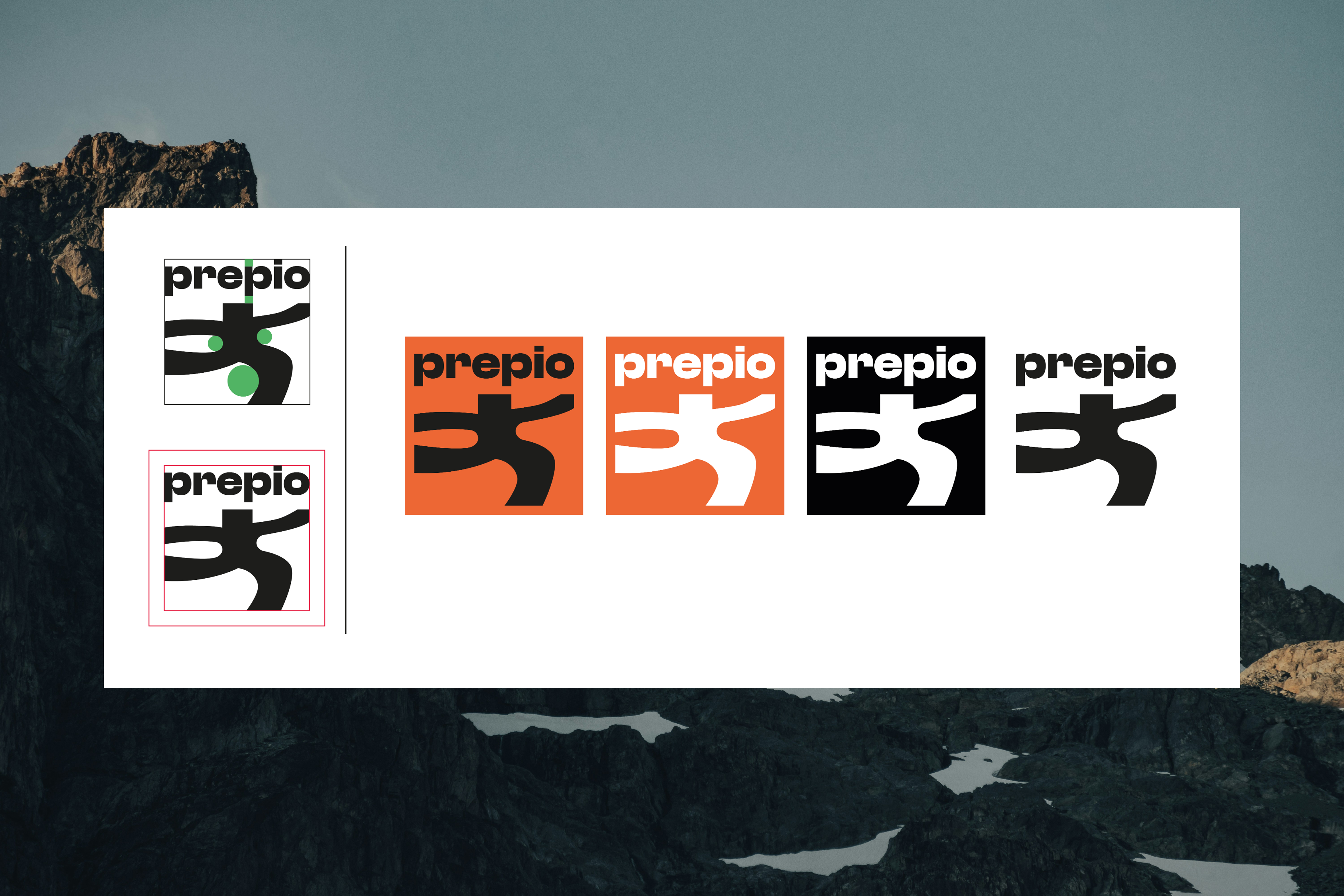
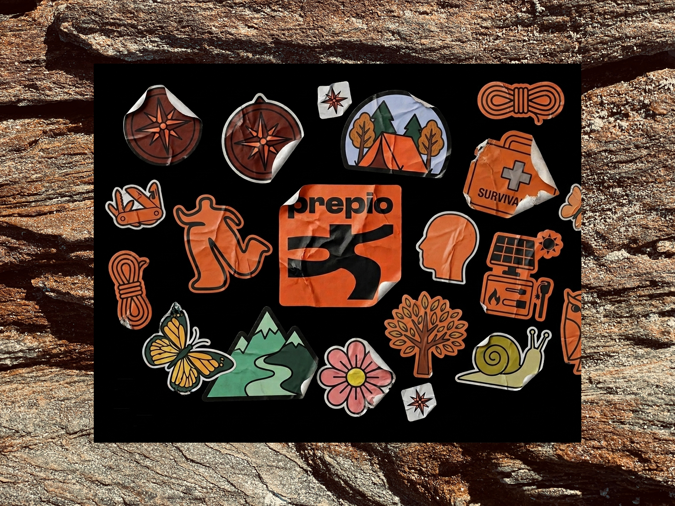
Prepio was a brand concept standing at the intersection of two seemingly incompatible worlds – urban streetwear design and survival gear for crisis situations. The target customer was not a typical outdoor enthusiast but a city dweller who wants to be prepared without looking like someone waiting for the apocalypse.
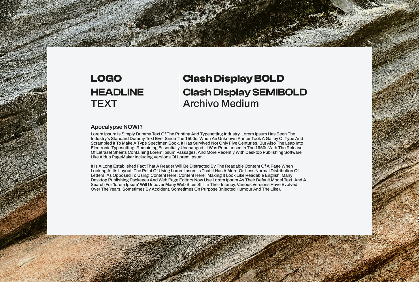
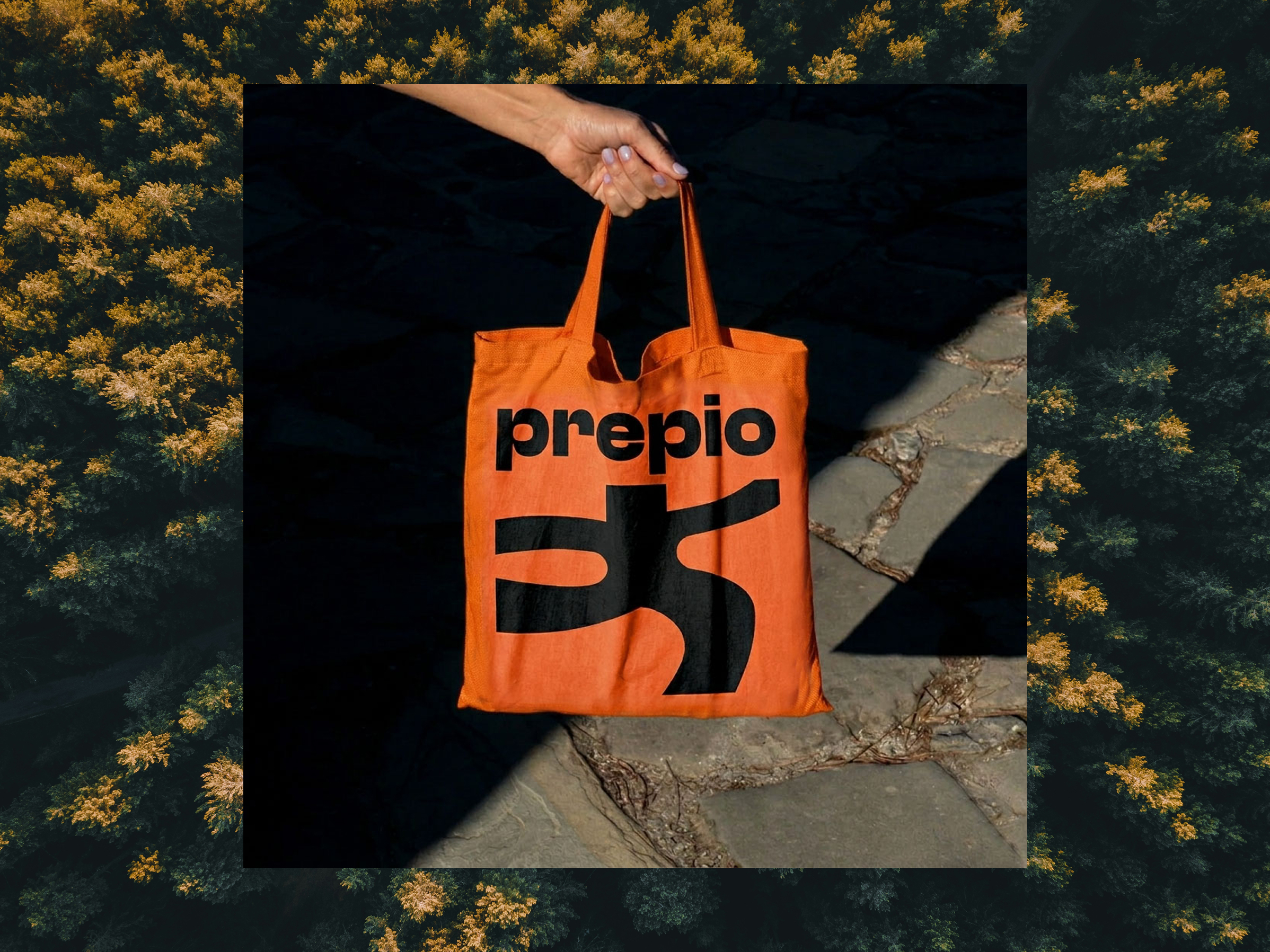
The visual identity naturally reflects this duality. The bold orange logo with an abstract symbol evokes both trail markers in the field and the energy of contemporary branding. The color palette combines a saturated orange with natural greens and dark tones, carrying names like Peeled Orange, Camo Pants or Common Ground. The typographic system built on Clash Display and Archivo Medium keeps the visual firmly anchored in a contemporary design context.
The project was ultimately not realized, but the resulting brand identity forms a fully functional visual foundation.
Credits
Client: Prepio / Starlight Labs
Art direction & graphic design: Markéta Kosinová
Copywriting: Tomáš Kovařík
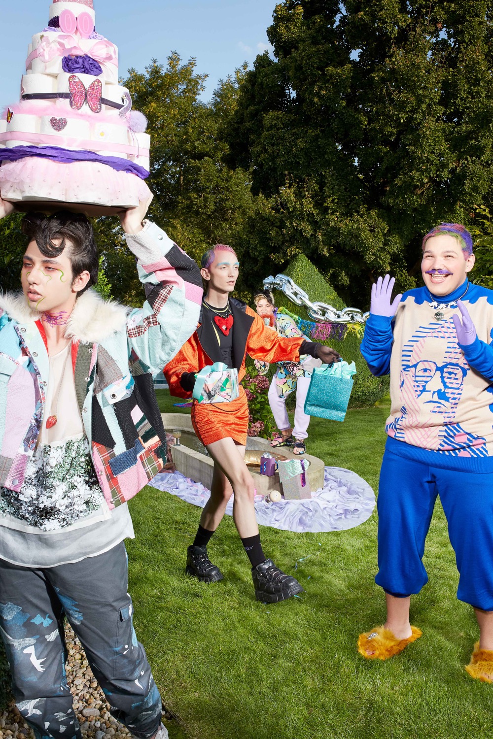
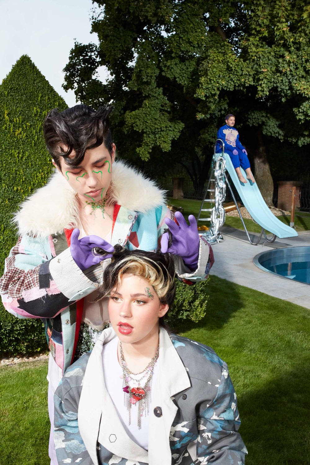
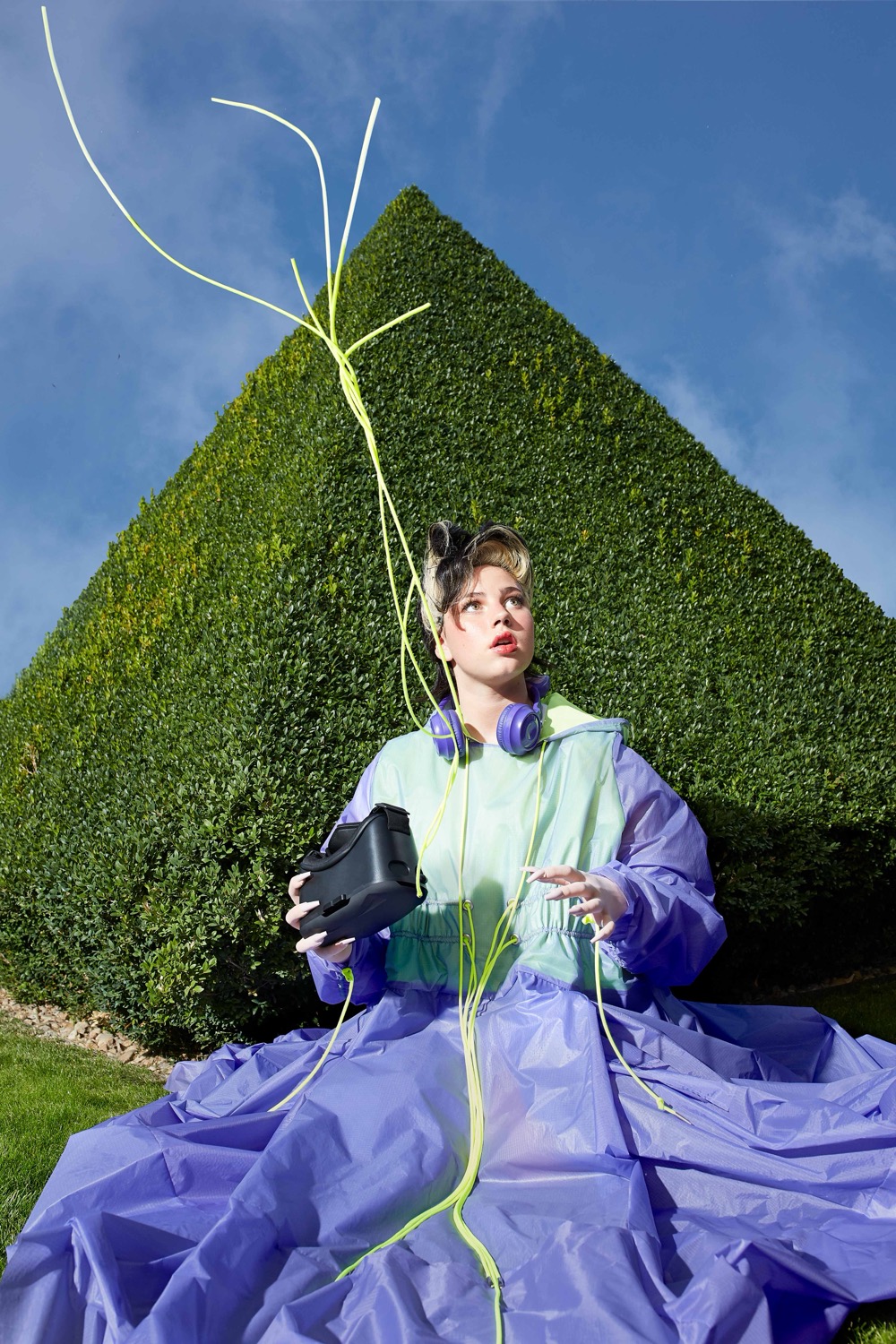
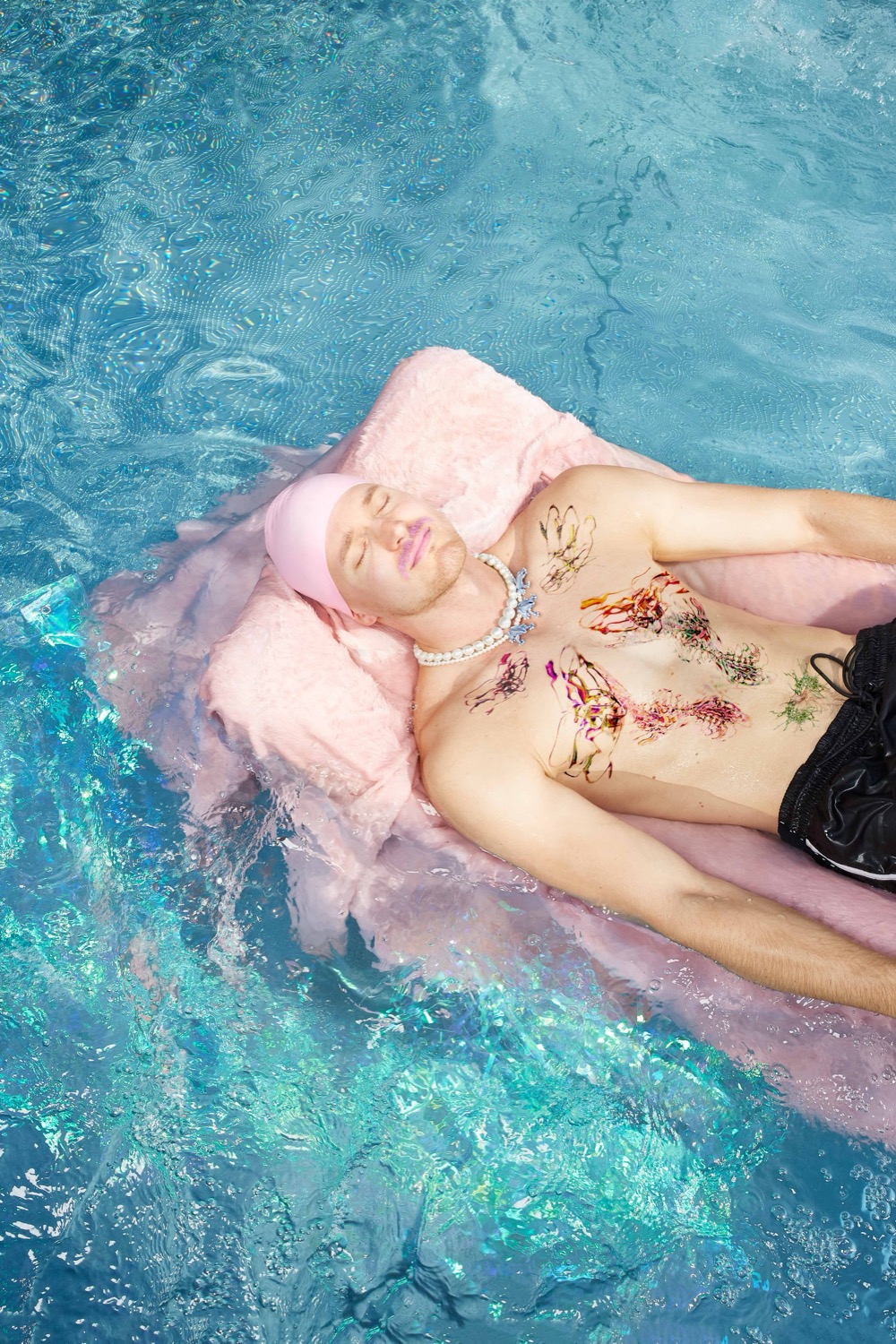
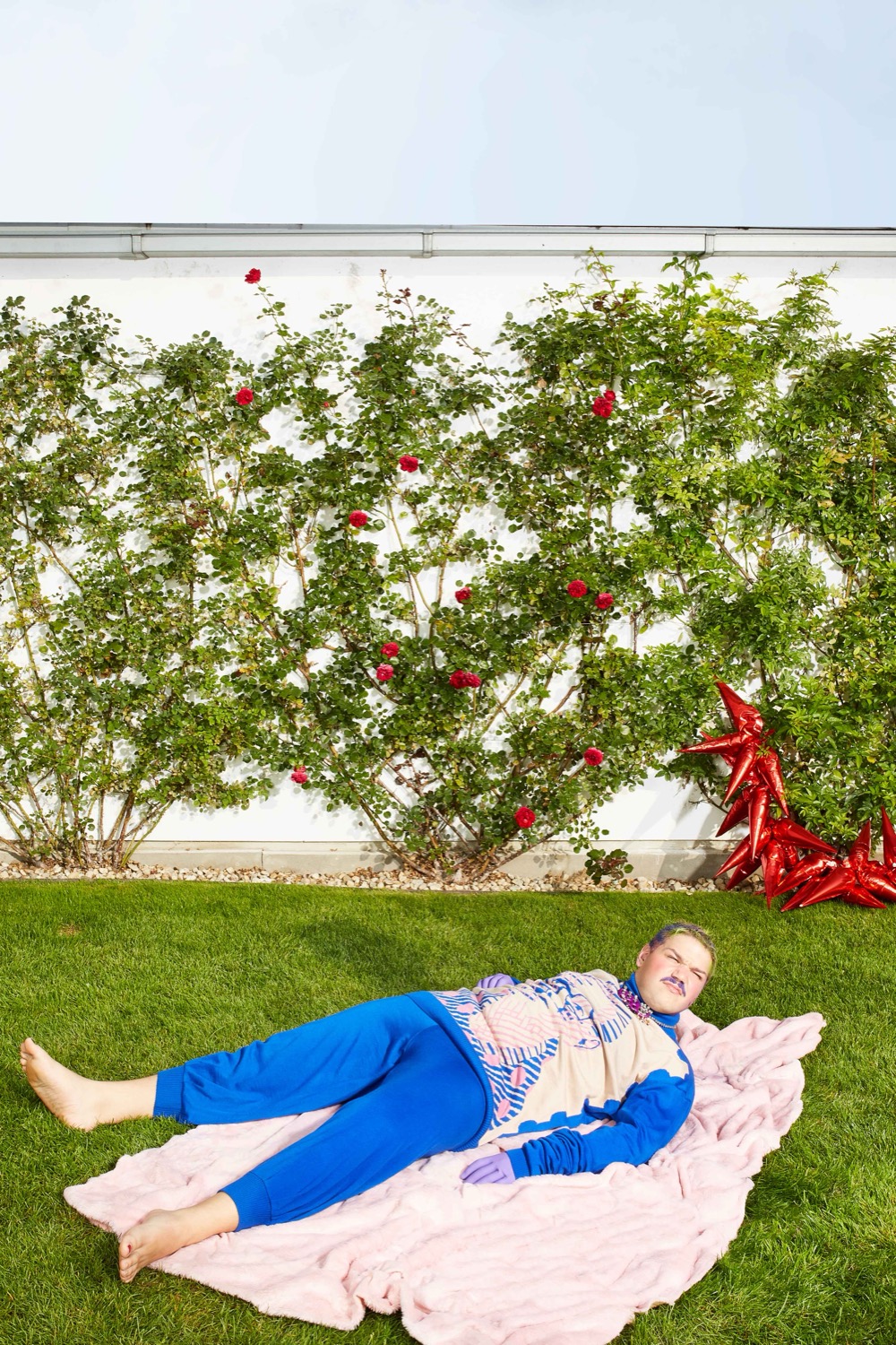
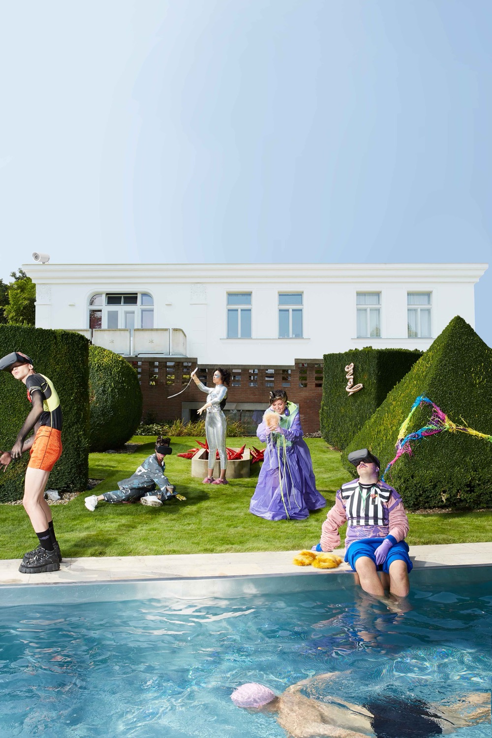
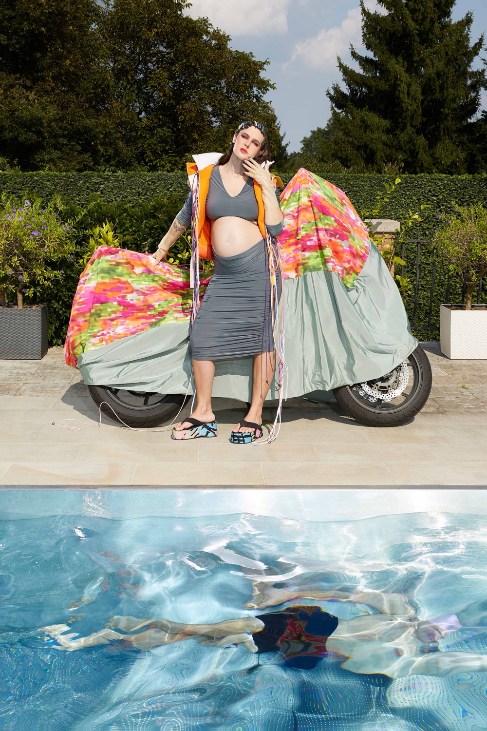
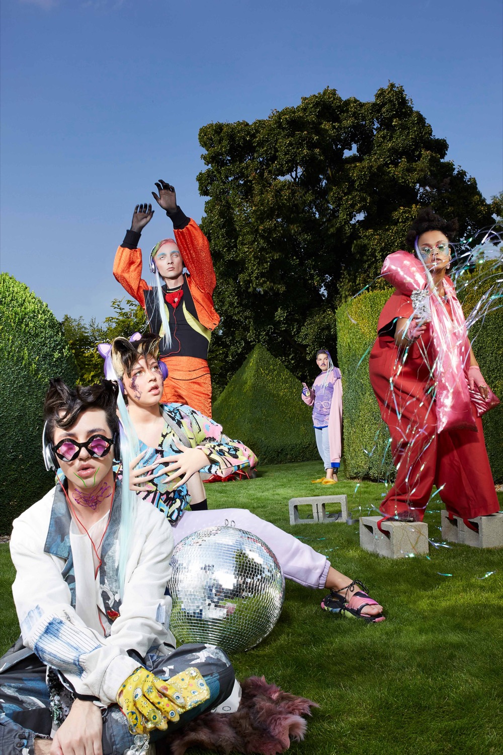
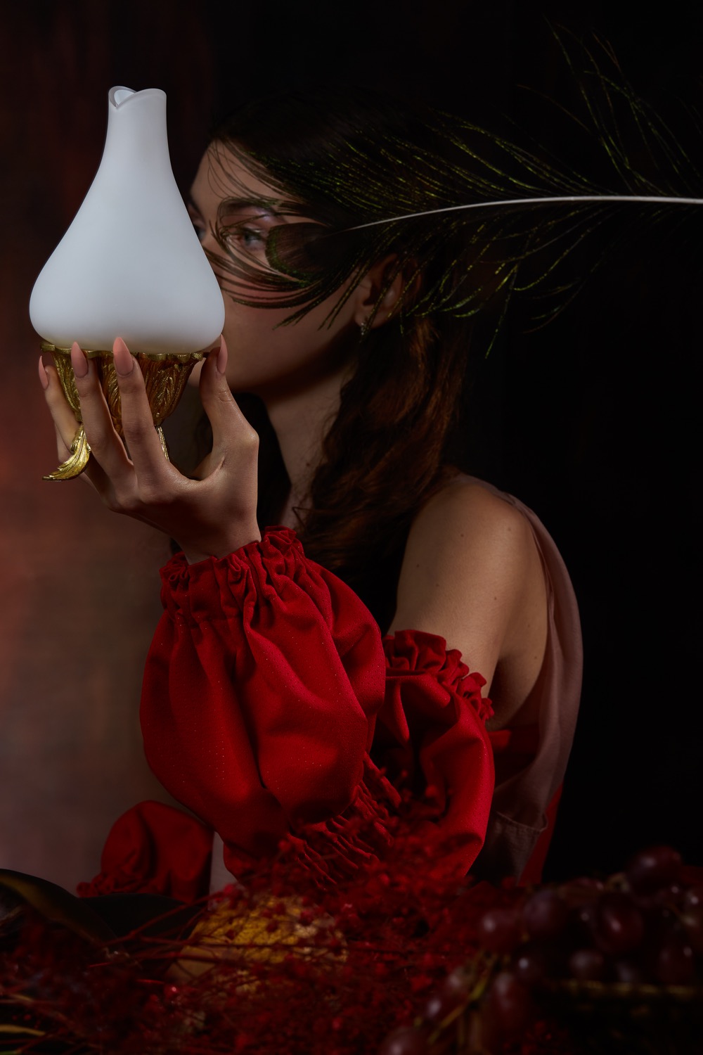
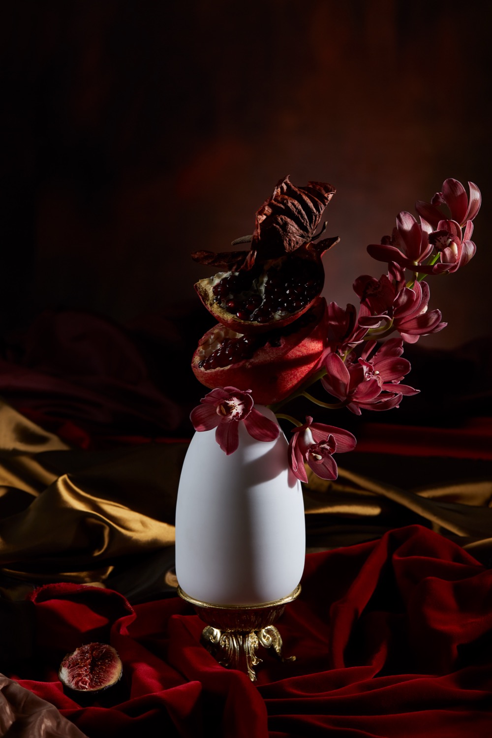
For this editorial for Swarm Mag, we served as creative directors and production assistants. The concept draws from the films Dogtooth and The Exterminating Angel and works with the motif of a group of people trapped in a beautiful villa, preparing for a birthday party with no way to leave. The visual and textual world of the editorial is deliberately shifted – words carry different meanings than usual and reality slowly dissolves. The project also included an original text written in this deliberately distorted language, accompanying the entire photo series and completing its atmosphere.
The editorial was published in SWARM MAG.
Credits
Client: Swarm Mag
Photography & creative direction: Shotby.Us & Markéta Kosinová and Kateřina Hynková
Photo assistant: Zdeněk Buchlák
Lighting: Tomáš Orálek & Zdeněk Buchlák
Assistant: Jirka Horenský
On-set assistant: Františka Blažková
Location manager: Miloš Veselý
Production coordinator: Vít Pecka
Executive producer: Petr Oplatka
Set design: Vítek Ehrenberger
BTS video: Tereza Polatová
Styling: Kateřina Hynková
MUA: Barbora Lipenská
Hair: Phil La Noiraude
Stylist assistant: Klára Sládková
3D Tattoo graphics: Lukáš Prokop
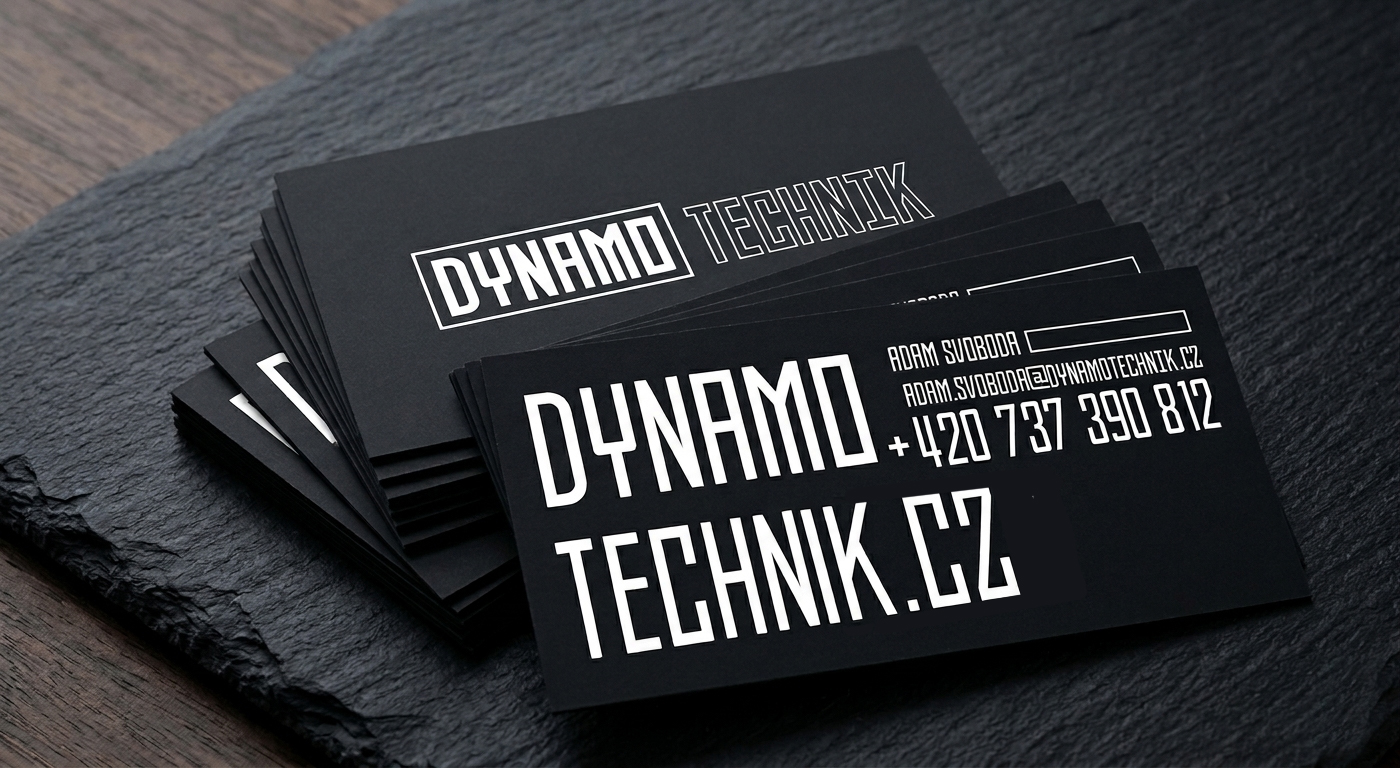
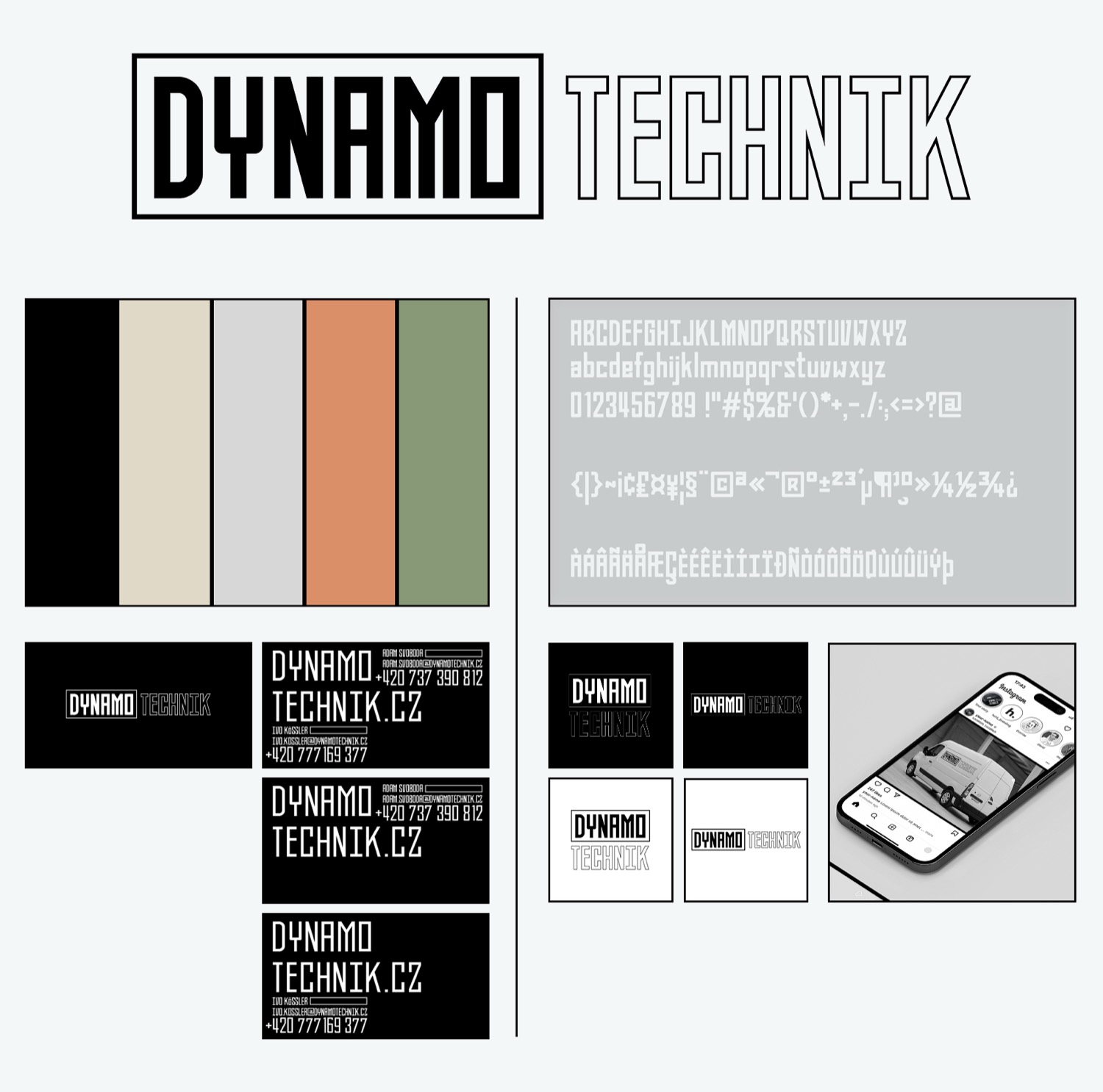

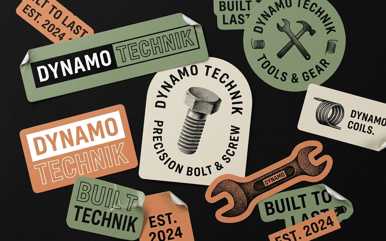
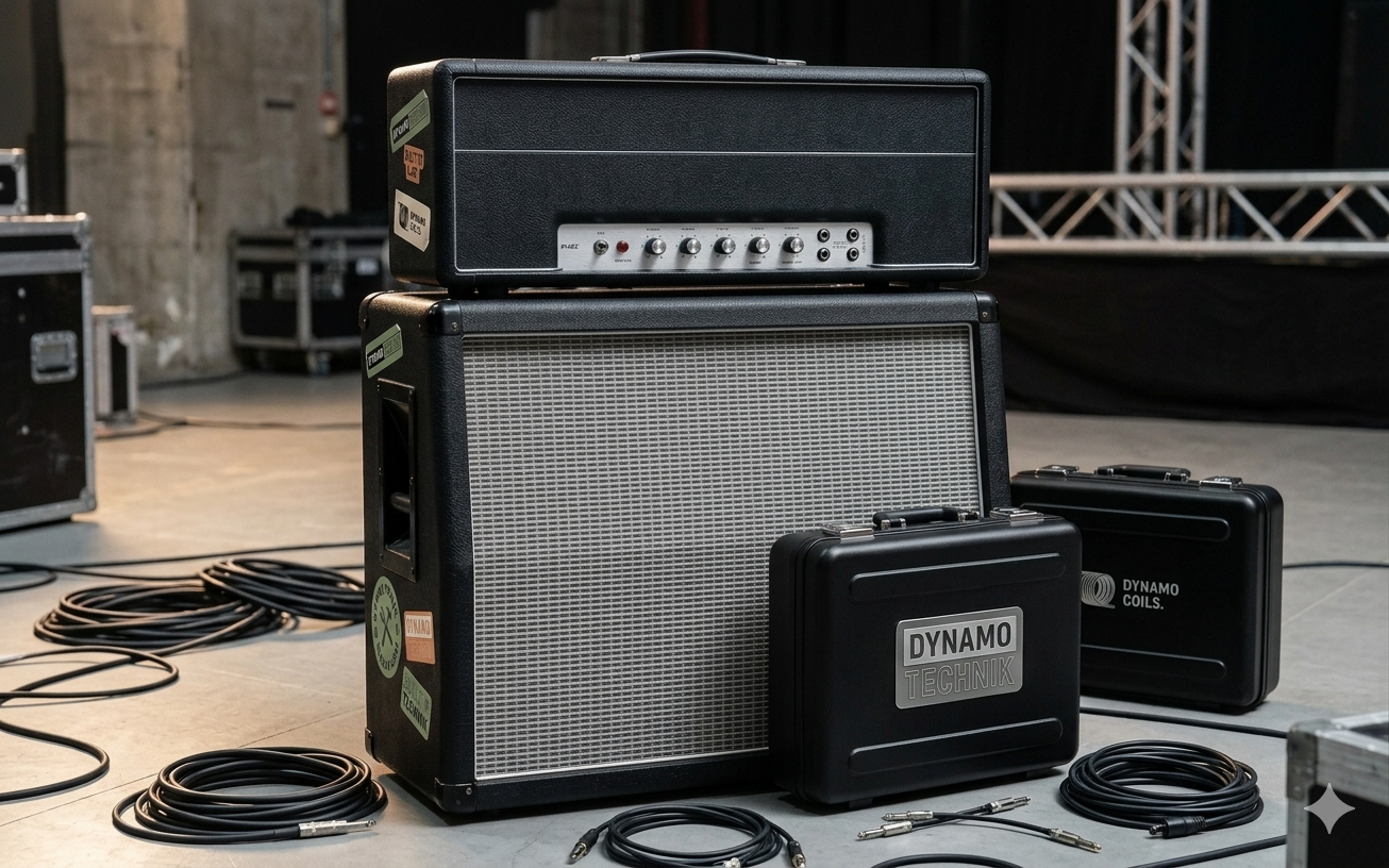
For audiovisual equipment rental company Dynamo Technik, we designed the foundational visual identity. The company operates in the world of conferences, theaters and concerts and needed an identity that naturally reflects the technical character of its work without feeling sterile or generic.
The brand's visual language is built on a slightly brutalist approach, bold condensed typography and a color palette combining black with muted earthy and grey-green tones. The deliverables included business cards in several variants and templates for company vehicle wraps.
Credits
Client: Dynamo Technik
Art direction & graphic design: Markéta Kosinová

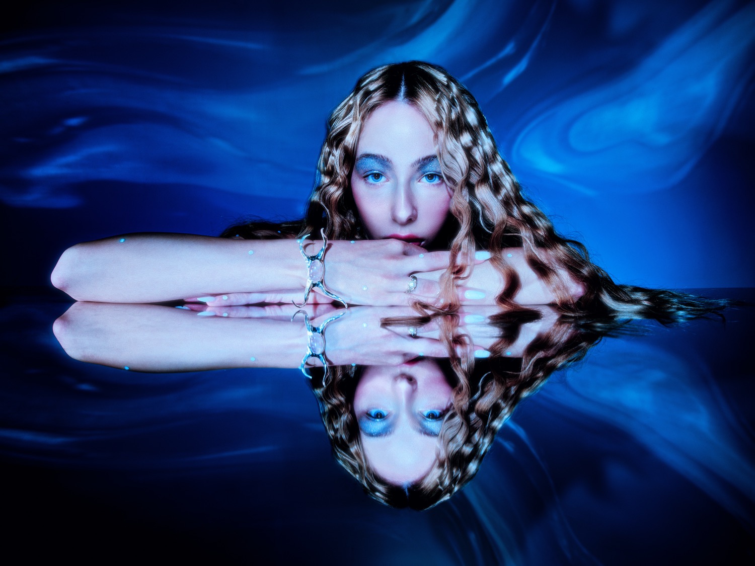
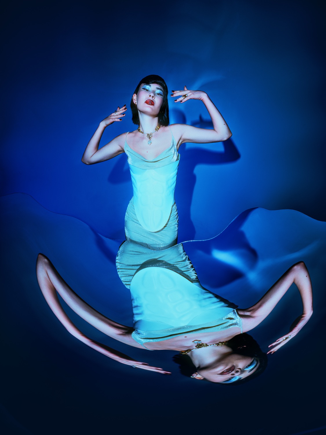
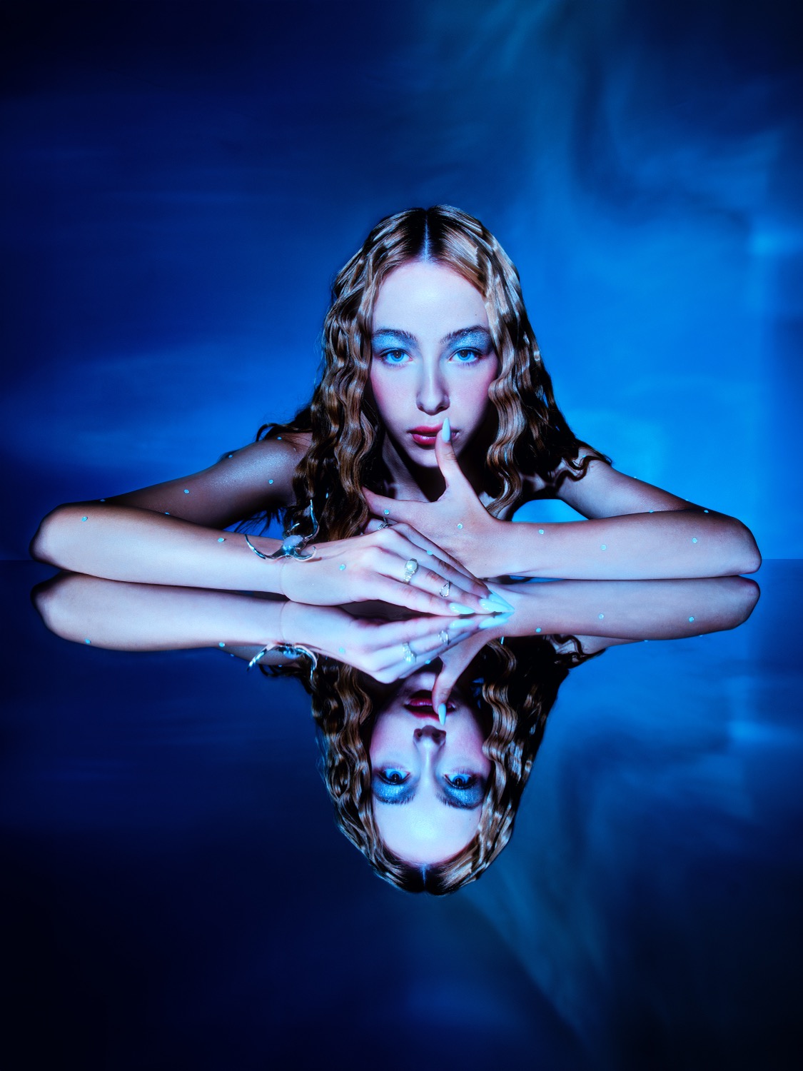
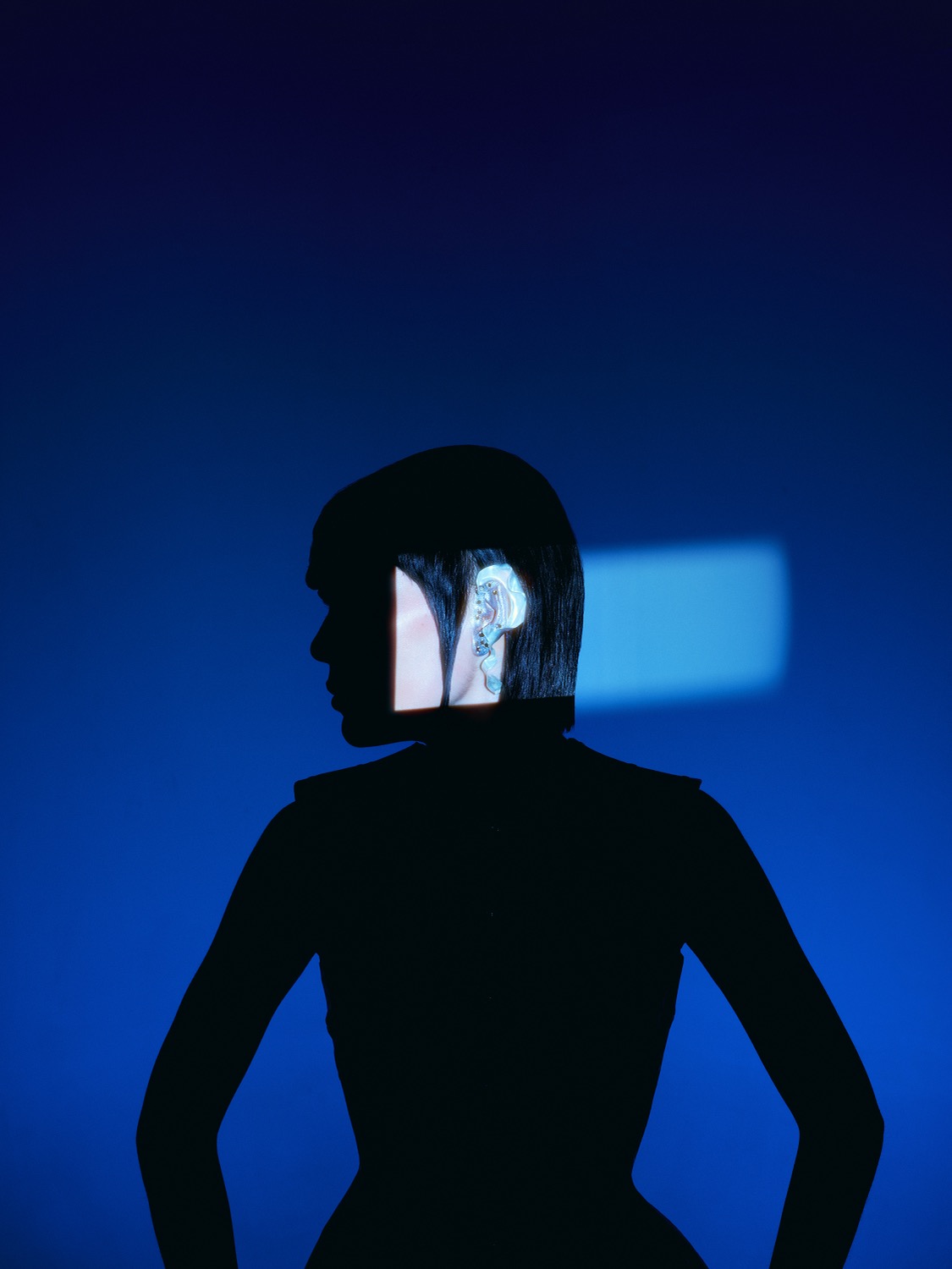
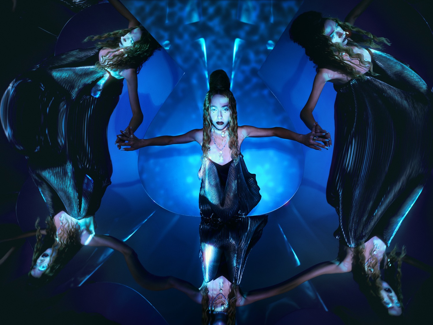
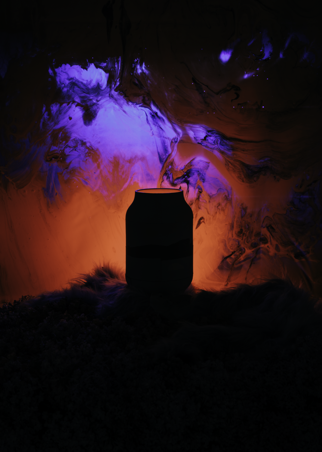
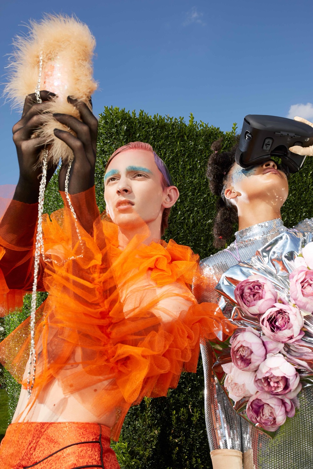
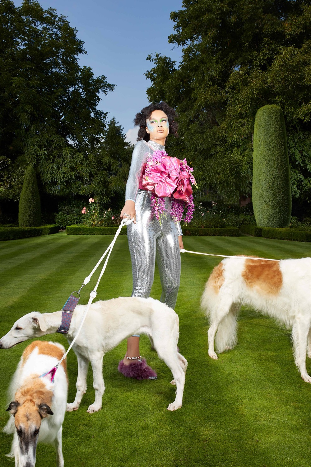
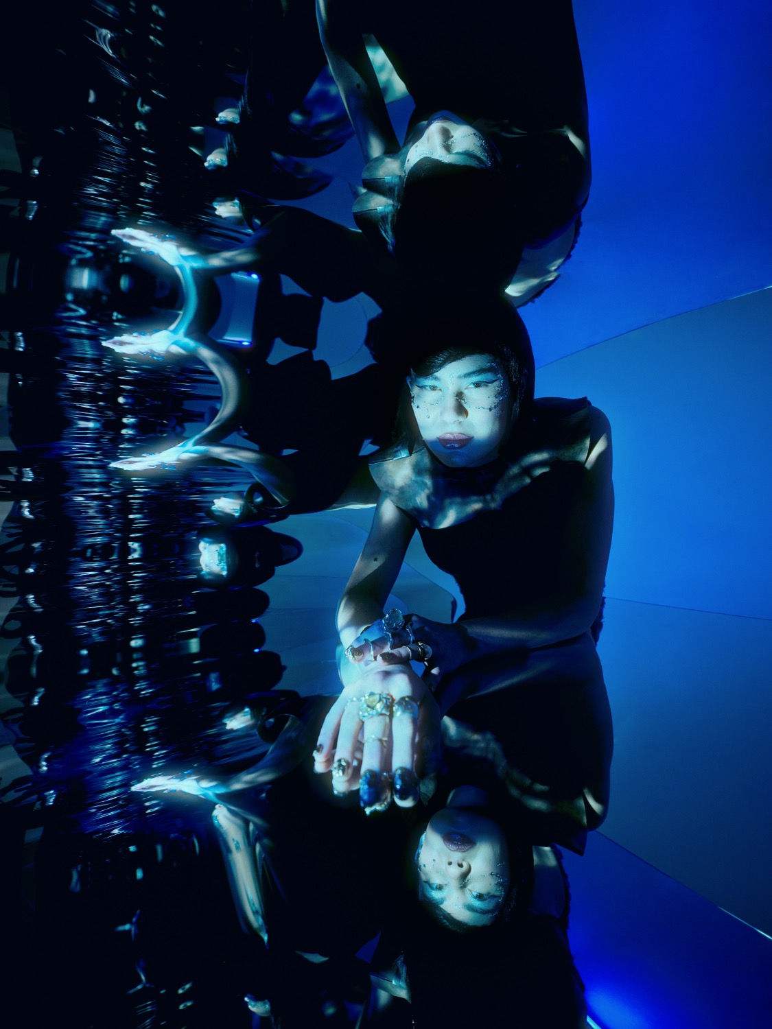
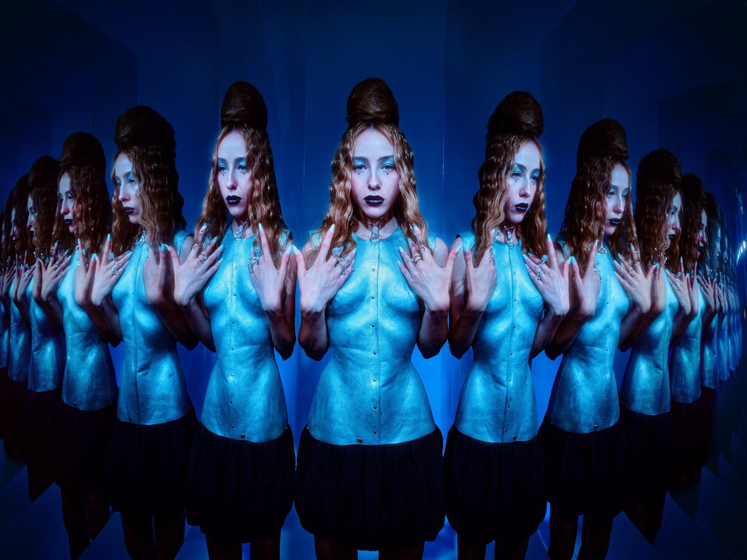
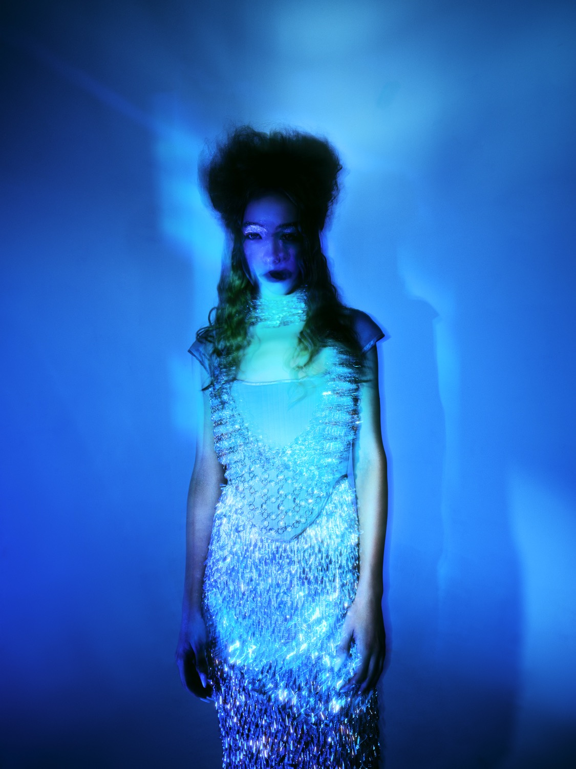
For this editorial for Swarm Mag, we were behind the creative direction and concept. The subject draws from mythology and the poetics of the underwater world – blue metal as a mystical material that lures, seduces and reflects light beneath the surface. The editorial's visual world connects Y2K aesthetics with cobalt depths, references the Lady of the Lake and Persephone, and works with the motif of a golden find that may turn out to be nothing more than an illusion.
Credits
Client: Swarm Mag
Creative direction & concept: Markéta Kosinová & Kateřina Hynková
Photography: Ondřej Szollos
Photo assistant & retouch: Tomáš Jakubec
Styling: Kateřina Hynková
Stylist assistant: Aladdinjane
MUA: Cheshirecat8
Hair: Kateřina Holcknechtová
BTS video: Marie Henrik
Set PA: Markéta Kosinová
Production: Markéta Kosinová
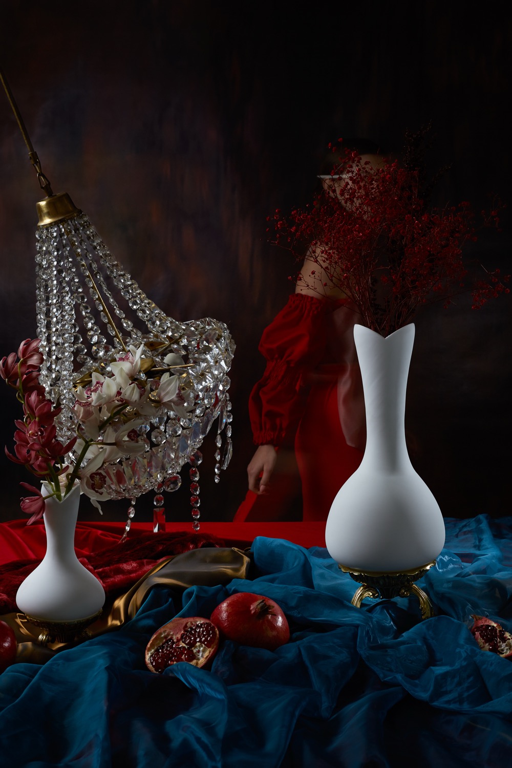
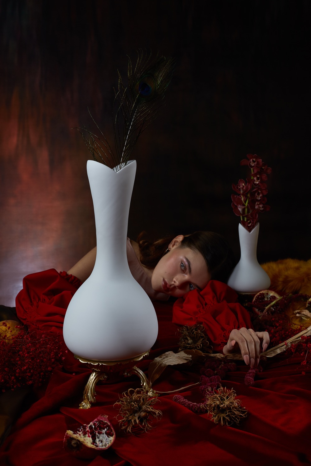
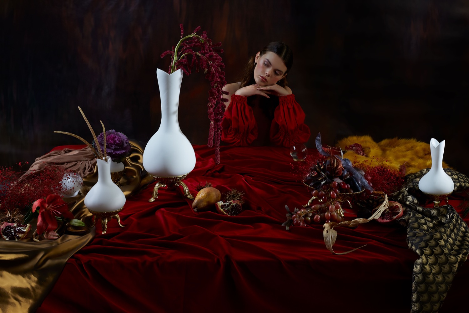
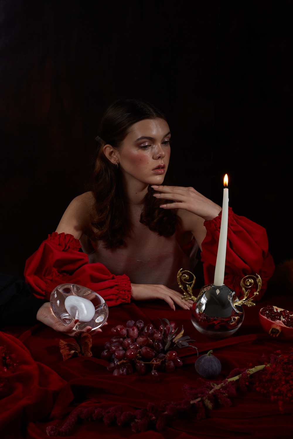
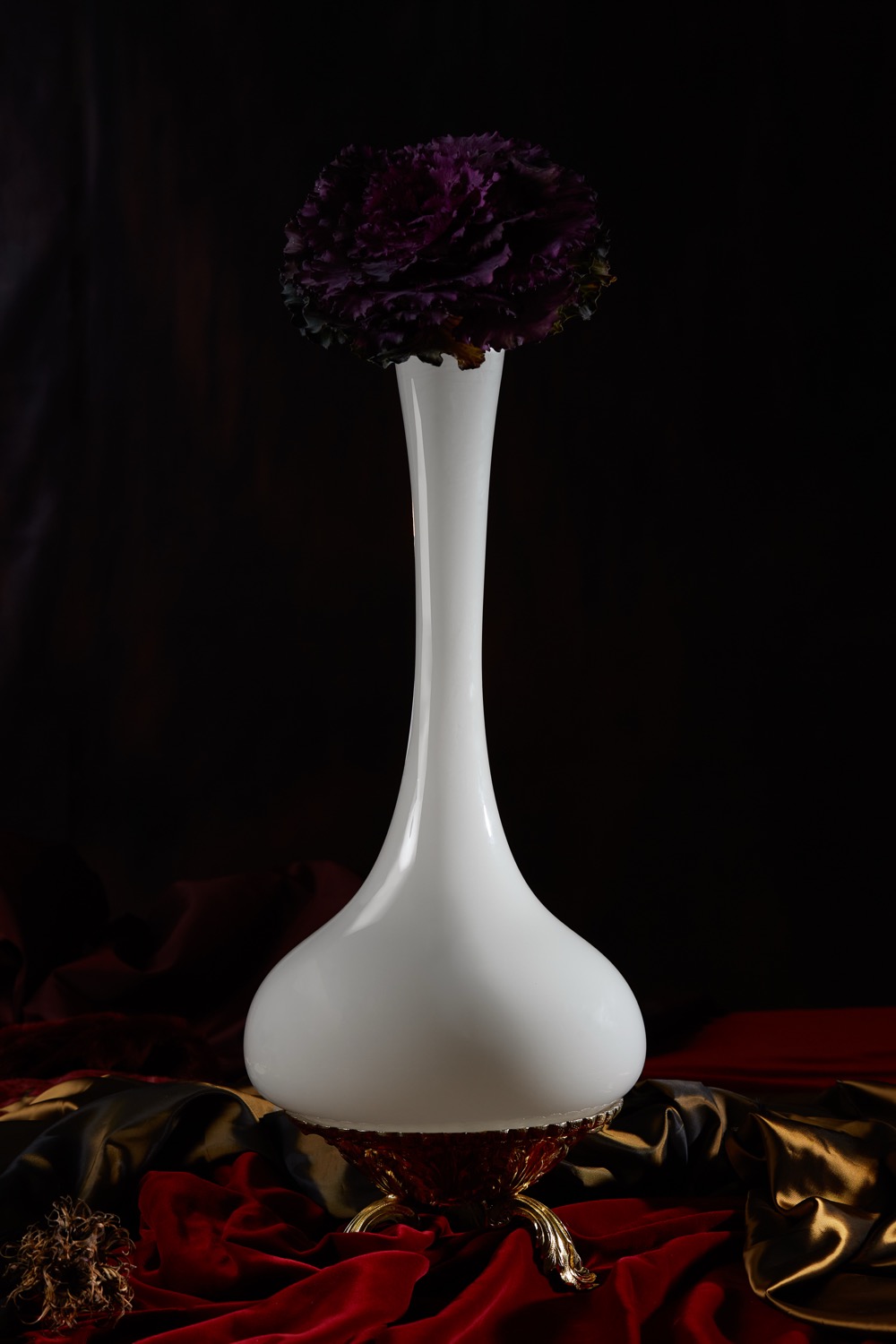
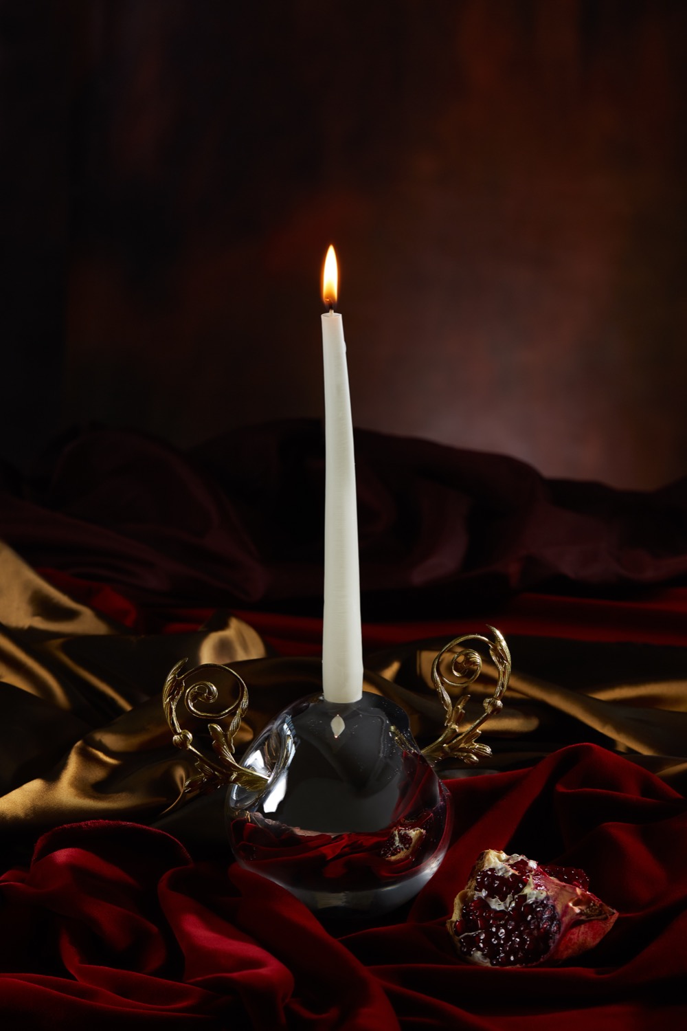
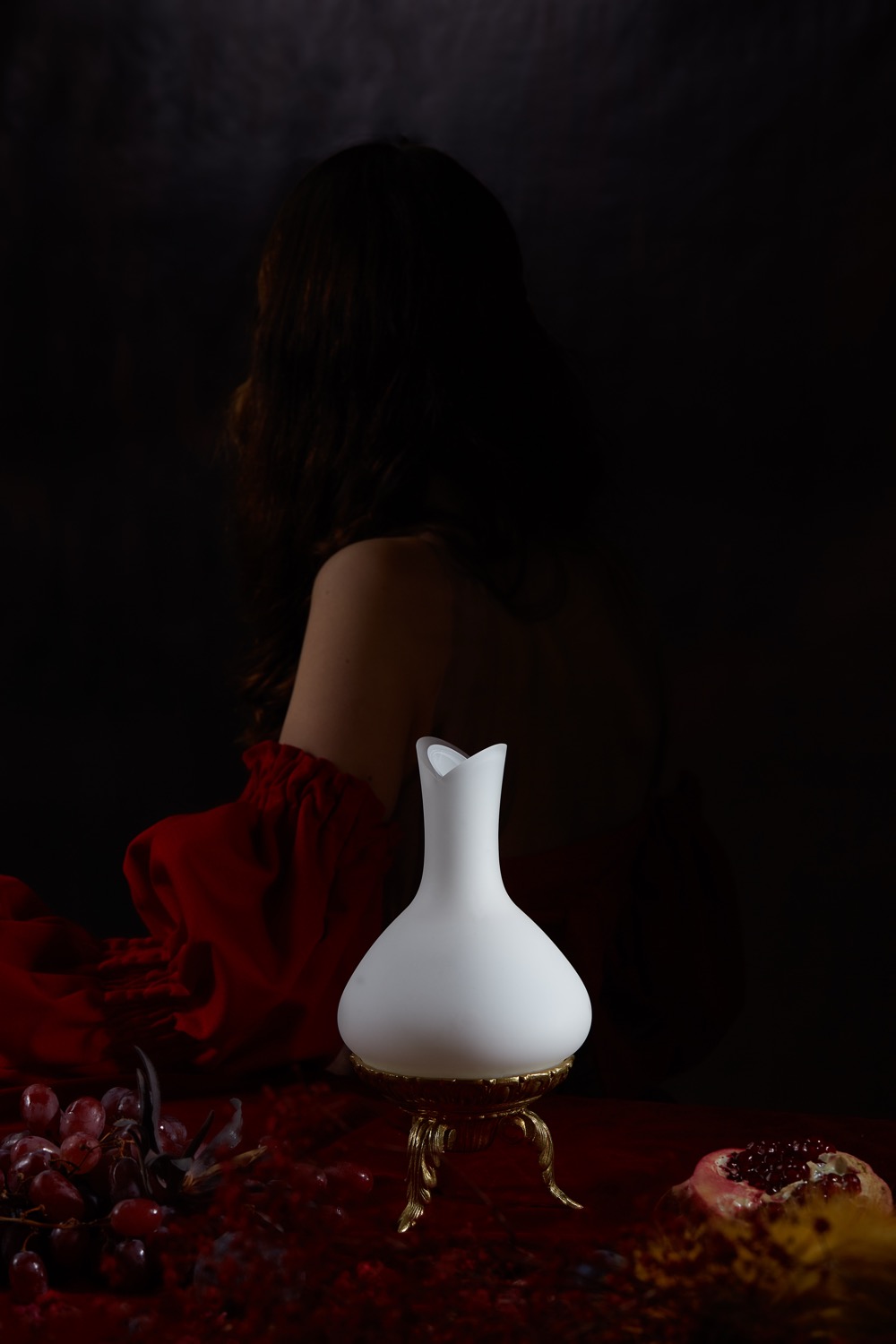
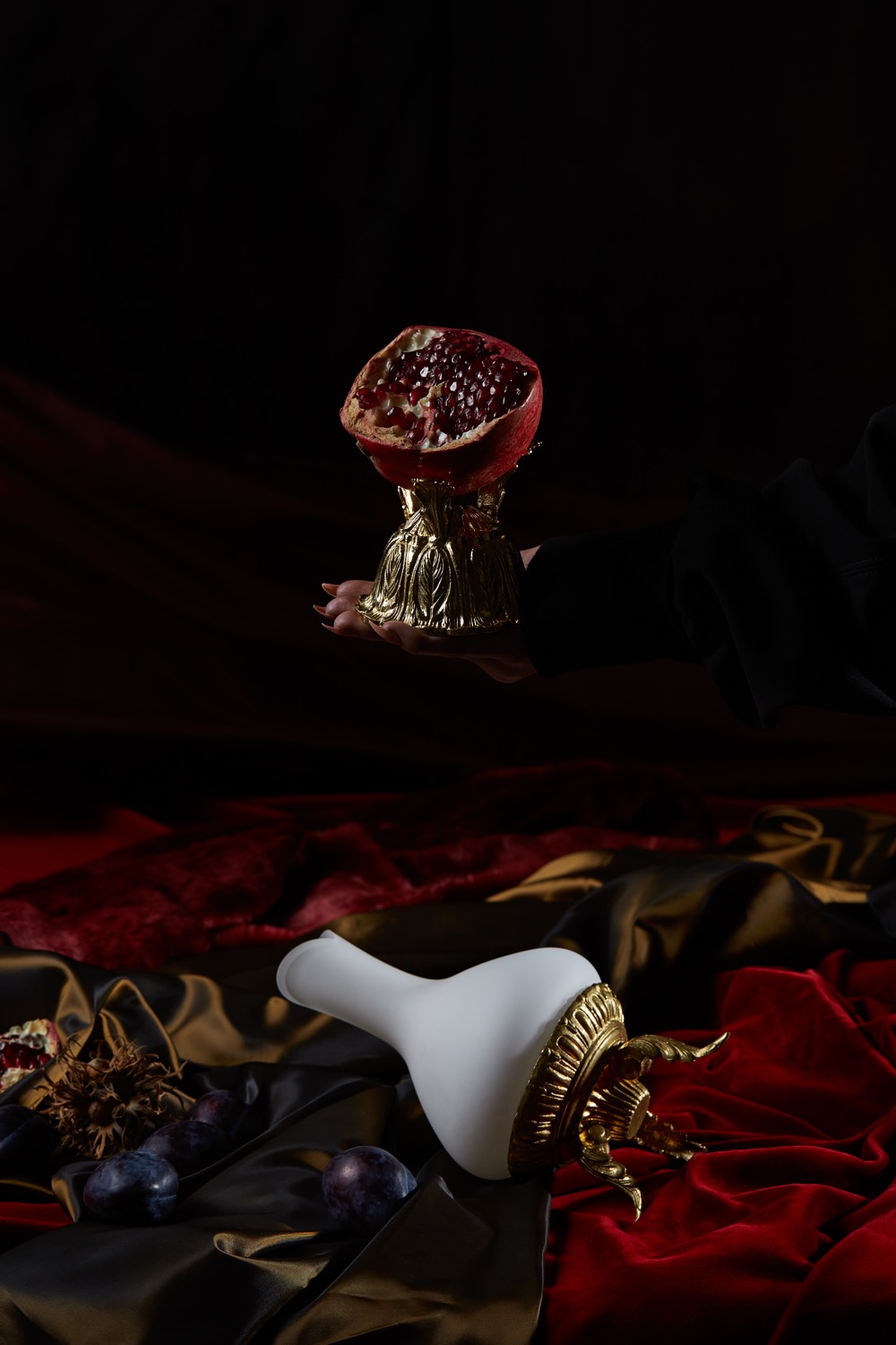
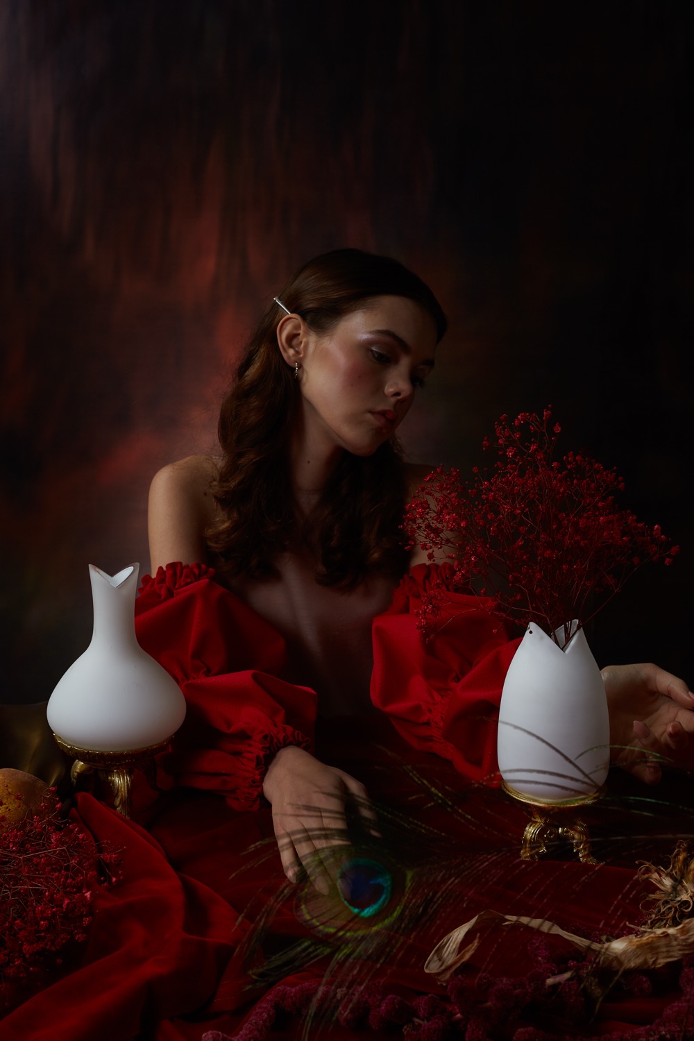
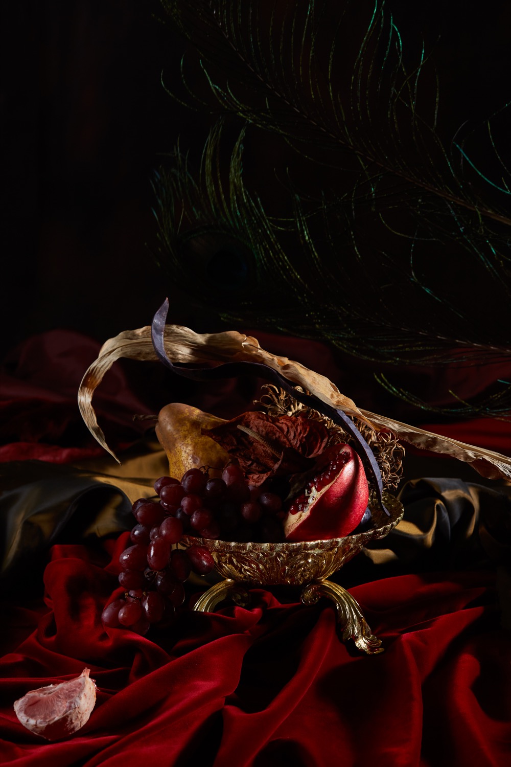
For Salansky studio, we oversaw production and art direction of an editorial photo series for the launch of the new Klondike vase collection. The collection is built on a dialogue between hand-blown opal glass and brass legs originating from historical cast-iron chandeliers. In the spirit of the gold rush, Klondike is about the joy of discovering new connections, rare materials and the stories they carry. The editorial translated this idea into a series of photographs that present the collection as design objects with their own character and history. The resulting photographs attracted the attention of the professional community and helped the collection reach international design media, specifically Dolce Vita and ELLE Decoration magazines.
Credits
Client: Salansky studio
Art direction & production: Markéta Kosinová
Photo: Shotby.us